Tuesday, August 30, 2011

Back to School and A. A. Milne

Wow!  School is off to a great and busy start!  I've barely had time to make any posts, let alone breathe!  My son, Noah and I got home this afternoon at 4:50 and before five minutes had passed we were both laying flat out on the carpet.  My art classes are brimming this year - seems that this economy has made people realize that they really need art to enrich their lives.  Noah had a good day, too, and when asked what his favorite class was, he quickly said, 'Theater!'

Perhaps because we all feel a little frayed this time of year, I'm going to give you one of my favorite A. A. Milne quotes.  Remember, Milne wrote Winnie the Pooh.  He said,
"One of the advantages of being disorderly is that one is constantly making exciting discoveries."
As for me and my house, life is pretty exciting over here right now.  Hope yours is, too.

Saturday, August 27, 2011

Hot!

Seriously?  "...but it's a dry heat..."

Monday, August 15, 2011

TRUE CONFESSION; addendum to previous post about Leaf Abstract

Okay, okay, I have to admit it.  I might as well tell you now, or my sins will find me out.

I had help with Leaf Abstract.  I generally like to keep this type of information well hidden, but I can't stand it.

My cat helped me.  In the top righthand corner, in the blue-meets-red flow I've got going, my cat jumped up onto the table and made it just a little more, ah, flowing.

Perhaps that's what makes the painting - who knows?

(oh, I feel better now... :)


Sunday, August 14, 2011

Painting Sold Today

We came home from church today to find that the gallery sold one of my paintings today.  It's a good day.

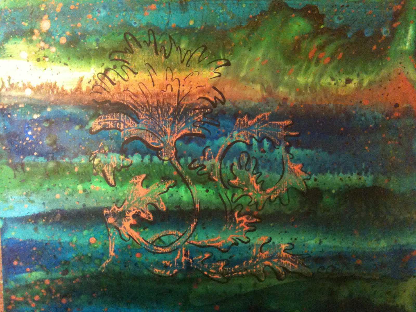
Before you read on, this is a perfectly awful photograph of a really pretty painting!  The colors flow together and are layered one on top of another to create new colors.  The overall effect is NOT the hots and the red colors you see here, but a nice balance of warm and cool colors.  The prominent leaf is gold pigment which sits on top of the other paints in relief.

This piece is about 20" x 30".  What you can't see is the amount of depth that shows up when you view it in person.  I use a combination of different types of inks, some recede and others step forward, so you have visual interest and can see through the top layers down to the bottom layers.

I named this one 'Leaf Abstract,' because it's built up of layers of bright colors upon which I printed leaves from my root beer plant, which I grow in our back yard.  The plant grows to about six feet, yields leaves which are about 15" long, and they actually do smell like root beer when you crush them!  Like!  The leaves are stiff with really prominent veins which lend themselves nicely to prints.

As I like bright, unsullied colors, I've got a lot of colors laid down in this painting.  During the process, I'm layering, lifting, spattering, moving and texturing, among other things.  Once I've got the under layers of the painting finished and completely dry, I brush the inks directly onto the leaf and print onto the YUPO.  Generally speaking, I'll make a print on a pretty thirsty paper first, THEN on the YUPO.  Doing a second printing with one inking is called making a ghost. As YUPO, which is polyeurethene, is absolutely non-absorbant, I almost always do a ghost.

Once I've got my leaf ink pattern laid down, I'll often use powdered gold pigment over specific areas.  I fill a fan brush with the powder and dust it quickly over the wet ink by tapping on my brush while I hold it above the painting.  It's pretty tricky getting it to obey me and land exactly where I want it, and I won't even know if the painting turned out until it's dry and I can brush off the extra gold pigment.  All this to say, I end up doing a lot of paintings before I come up with one I like.  I like this one a lot, and I'm glad someone else did, too! :)


Tuesday, August 9, 2011

Three Woodblock Acanthus Prints

I'm continuing to work with the print block I carved.  Here are three paintings I've done with it.  First I worked up the backgrounds, which often contain a number of layers of ink.  Each time I add a layer, I have to wait for some time between applications to add another layer.  Because of the nature of YUPO, when I do add paint, it needs to be done quickly and with NO mistake.  There's no going back with this stuff.  Any error will smudge off all underlying layers, down to the white.  Trust me on this one, I toss a bunch because the process is so tricky.  That old adage about artists producing 20 paintings to come up with one they like is pretty close to the mark.
I like this one because it's really bright and cheery.  The photo doesn't really show that the blue of the acanthus is a really stand-out color.  Of course, because blue and orange are complimentaries, that doesn't hurt, but the blue looks quite bright in person.
I added iridescents and bronzes to the paint for this one.  When you view it in person, it has the effect of floating on top of the background, for which I chose colors loosely representing a night sky.  I painted in some minimal shading to further the effect.

This one particularly shows the qualities I'm searching for in the details of the print.  There are spots without paint and spots that show the grain of the wood, which gives it an antiquey (is that a word? ... it is now!) flavour.  If I'm going to take the 40 hours to carve a woodblock, I want people to know when they view the prints!


This last one is called Acanthus Rising, and is my youngest son's favorite.  Once again, I built up many layers to give it a three-dimensional effect which, desunfortunadamente, does not show up online.  You can get a feel of some of the reflective qualities, though, and the bright spot on the top left is where the bronzes were reflecting light.  Because of the wildness of the background, I handpainted in more of the details of the flower to bring attention back to it.


Friday, August 5, 2011

Fall Art Classes

Hello, Wonderful People,

For those of you living in my area, I'm offering four art classes this year.  School starts in a couple weeks, so you need to sign up right away if you're interested.  I've already got one class full, but still have some room in the others. :)  You can contact me for details here, or at colorcatstudios@gmail.com.