I named this gorgeous paint pour ‘Luscious’ because, well, it looks luscious and the colors remind me of peaches and raspberries. You can find it at
Saturday, April 11, 2020
Quarantine Cheer
I named this gorgeous paint pour ‘Luscious’ because, well, it looks luscious and the colors remind me of peaches and raspberries. You can find it at
Friday, March 6, 2020
Phoenix Rising Painting
Any way you decide to orient it, I’ve now got it available on mugs, pillows, stickers, phone cases and more. You can find it here:
Thursday, December 12, 2019
Relaxing Paint Pour
I’m really happy with this piece and love the way the cells formed (a pouring artist’s goal). The cool colors are so calming they remind me of water and that little pop of hot red gels the entire work. I love it!
You can see where I signed it on and notice that all sides are a continuation of the front. Just one of those little extras I think this is important to the whole and enhances the entire painting. Also, the frame is two inches deep; one of my paintings has some real heft. Another indicator of quality.
And... our son...
Another closeup...
These babies are made not only for you but for your great grandchildren! Find this and similar works at www.colorcatstudios101.etsy.com
This last shot is the entire piece. Pretty much loving it.
Friday, August 23, 2019
Newest Painting, ‘Festival’
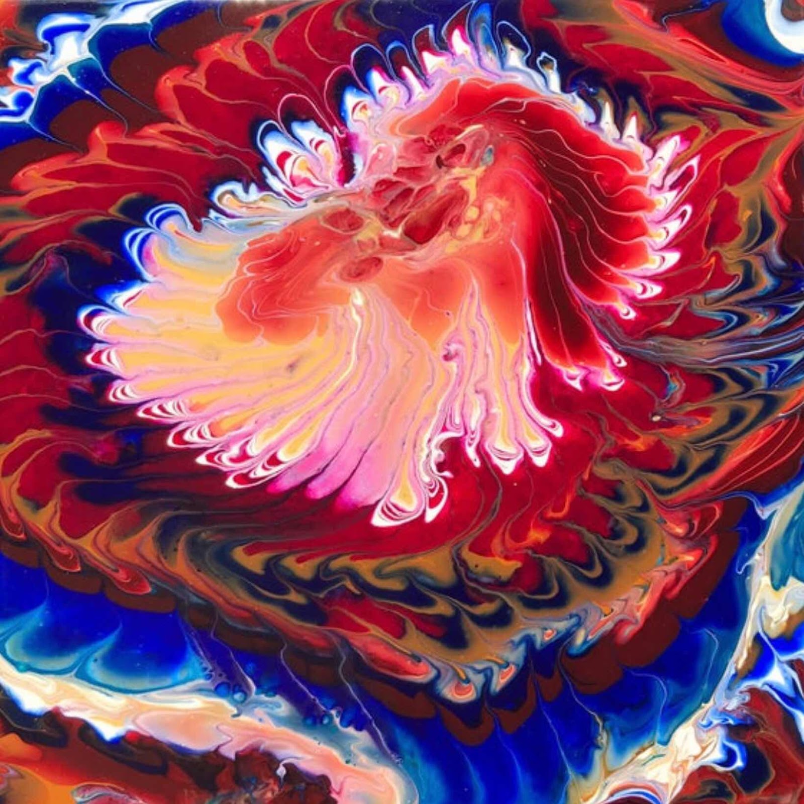
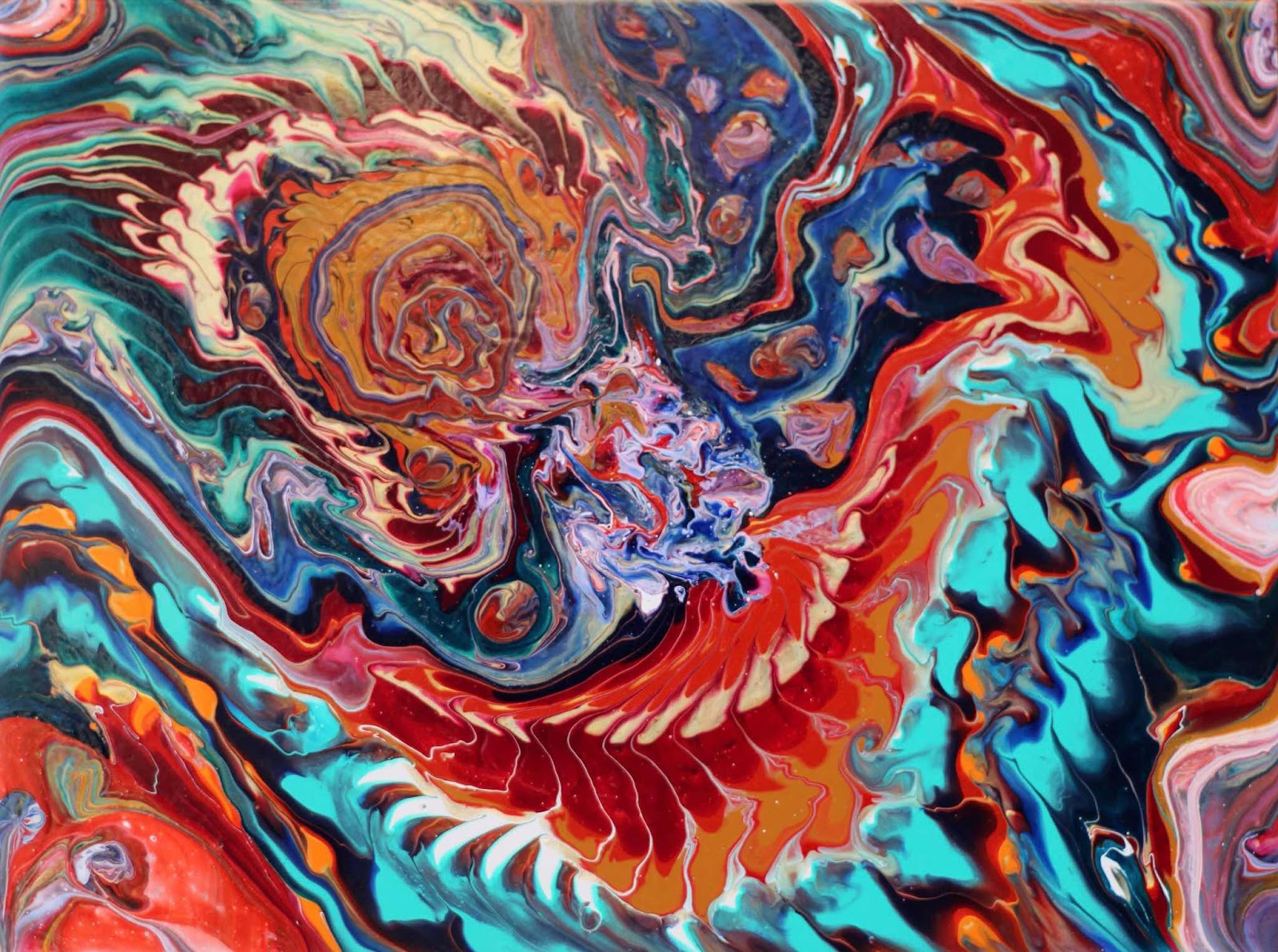
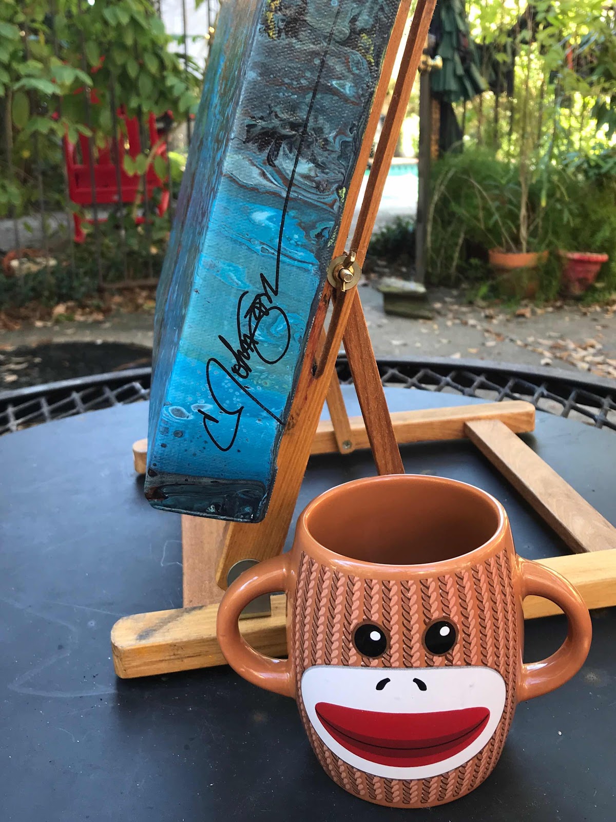
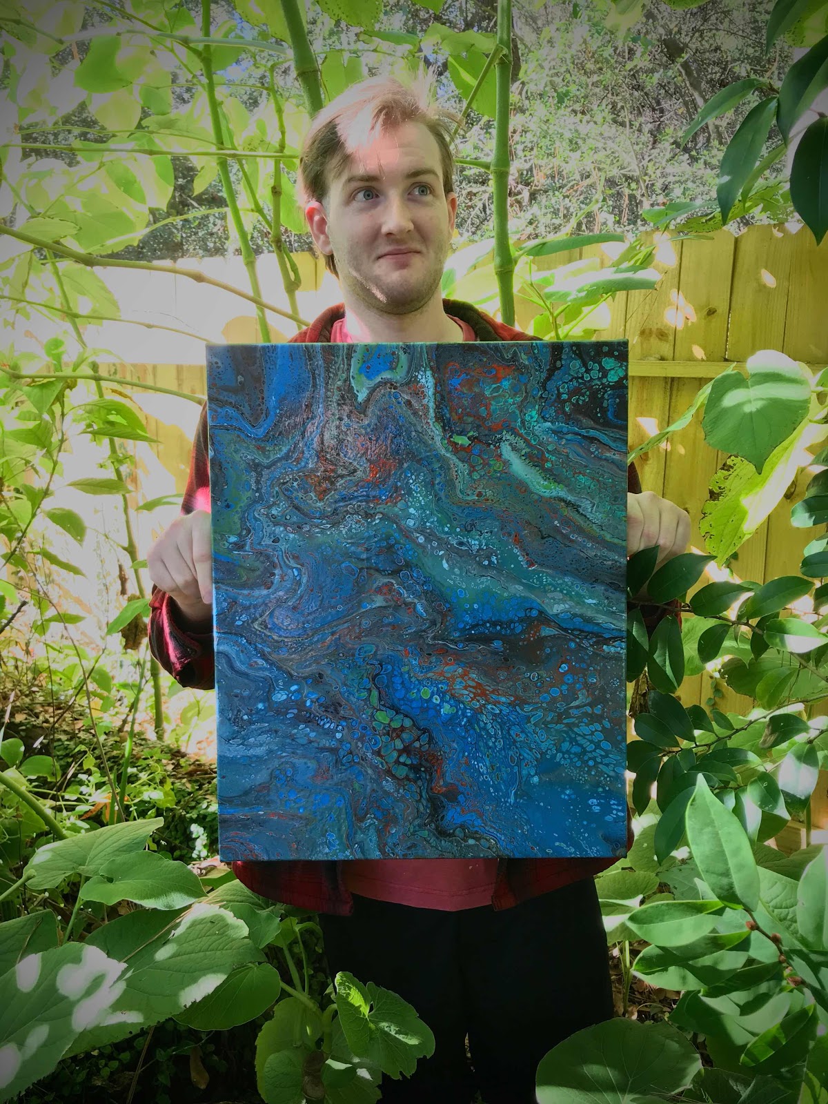
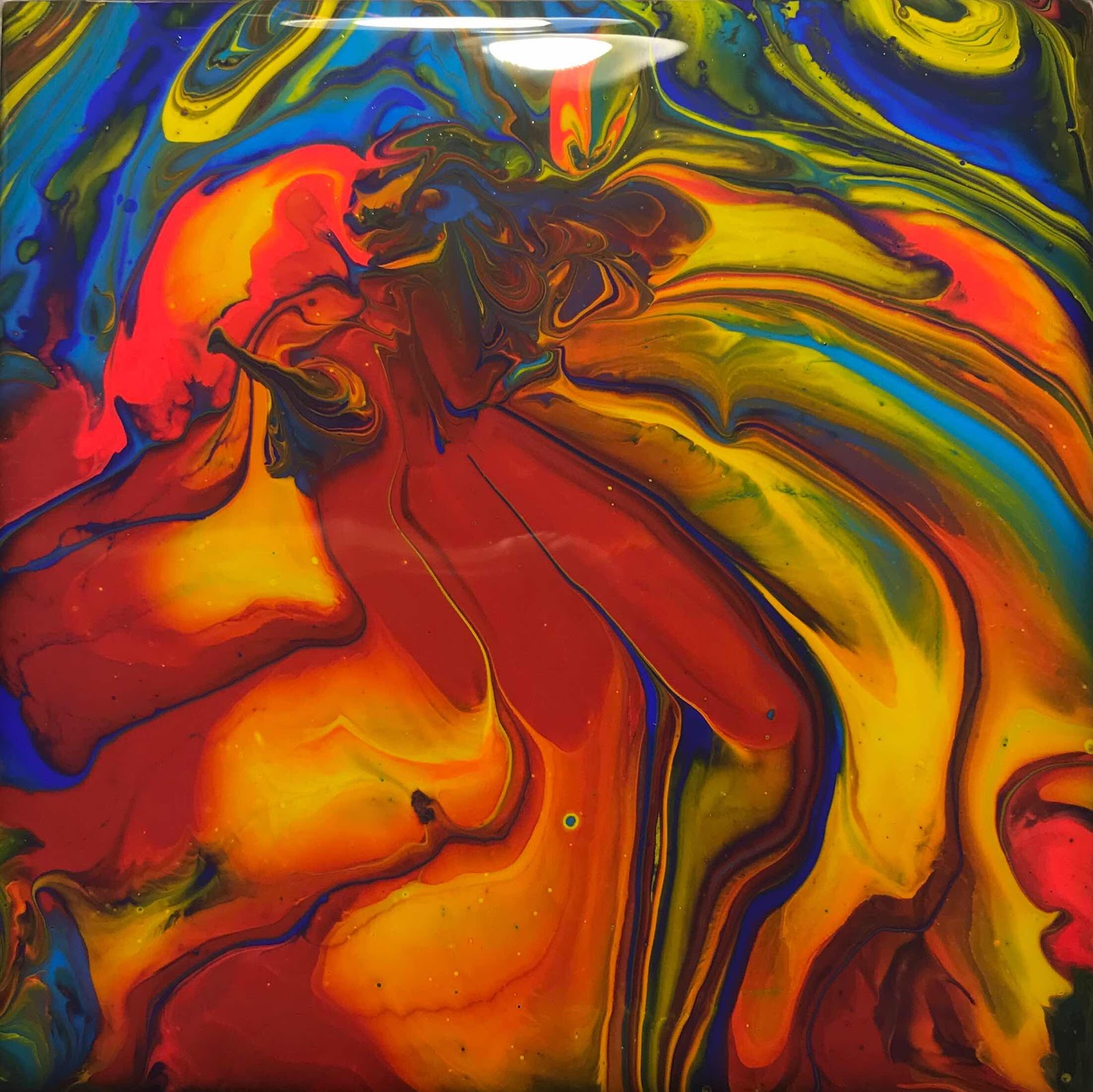
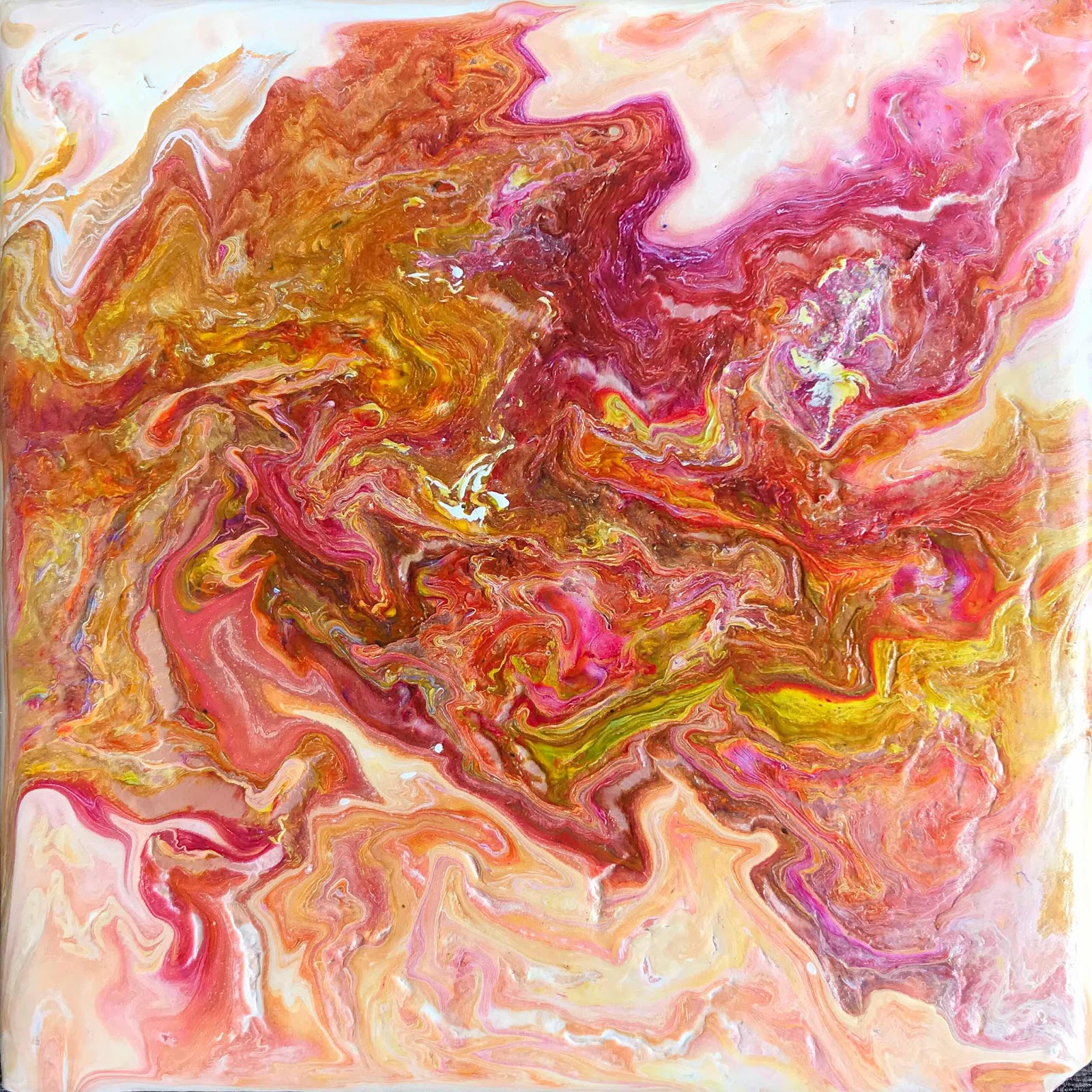
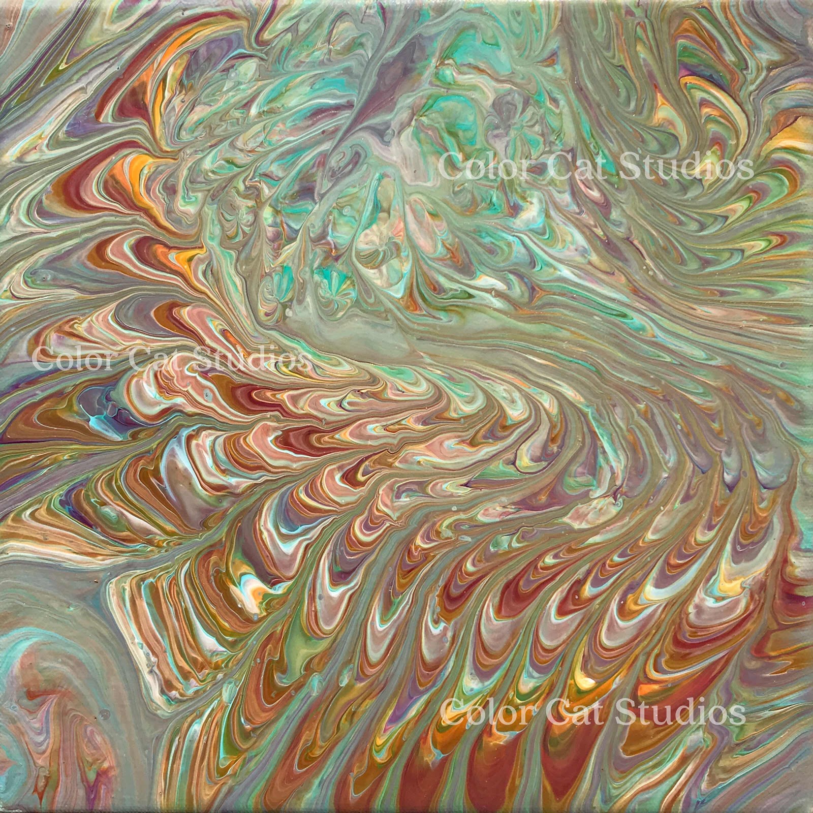
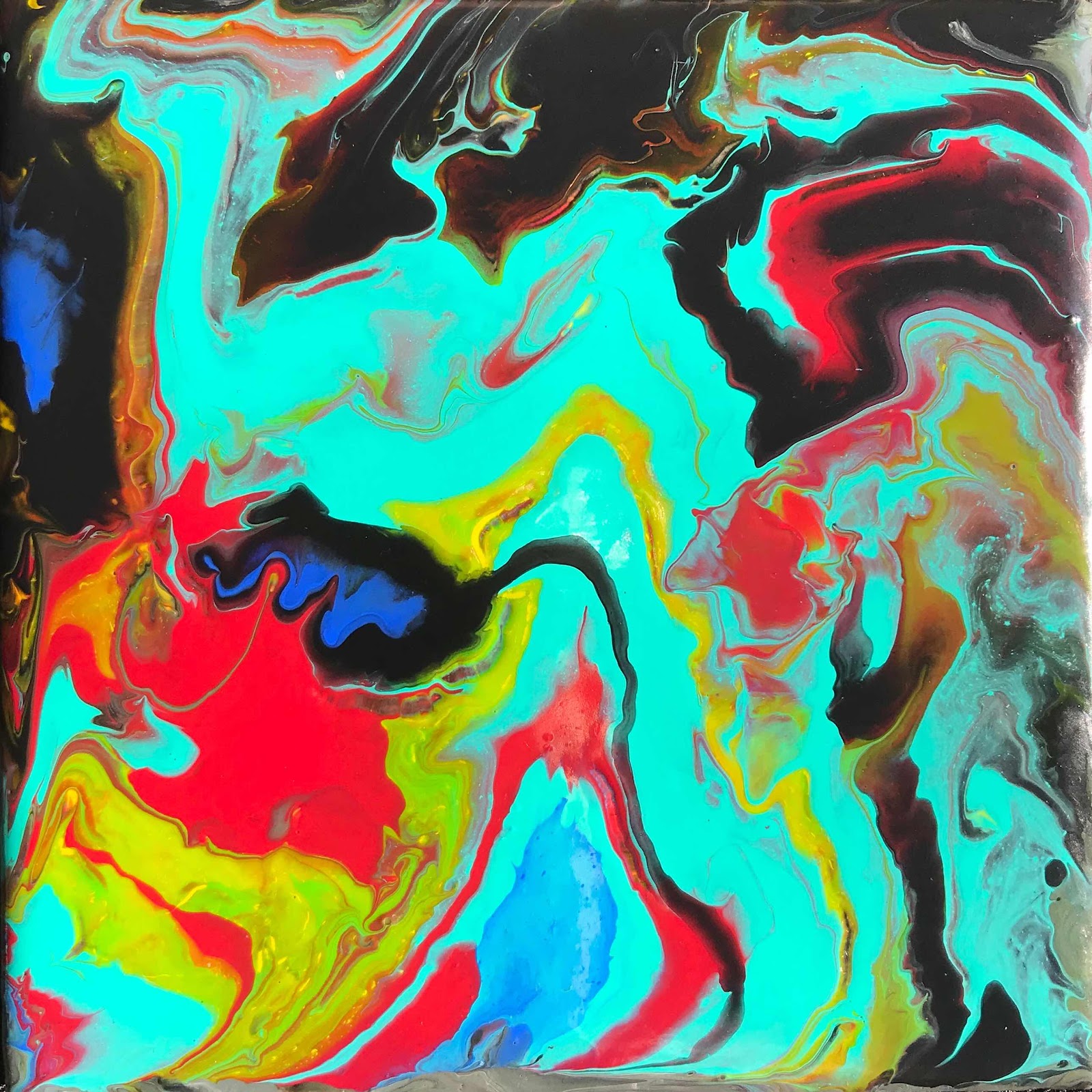
I decided to give you a little tour around my latest painting. This one is a 16x20 paint pour. I wanted to incorporate whole bunches of cheery, complimentary colors, a lot of gold and some iridescents for a downright, riotous festival. Hmm... I should name it festival. Festival it is! Now, to cure, then I have to varnish and wire it. Look for wonderful new stuff being added to my website regularly as I get ready for upcoming shows and Christmas giving. Super bad reflections in this first one; it’s mirror-shiny. :)
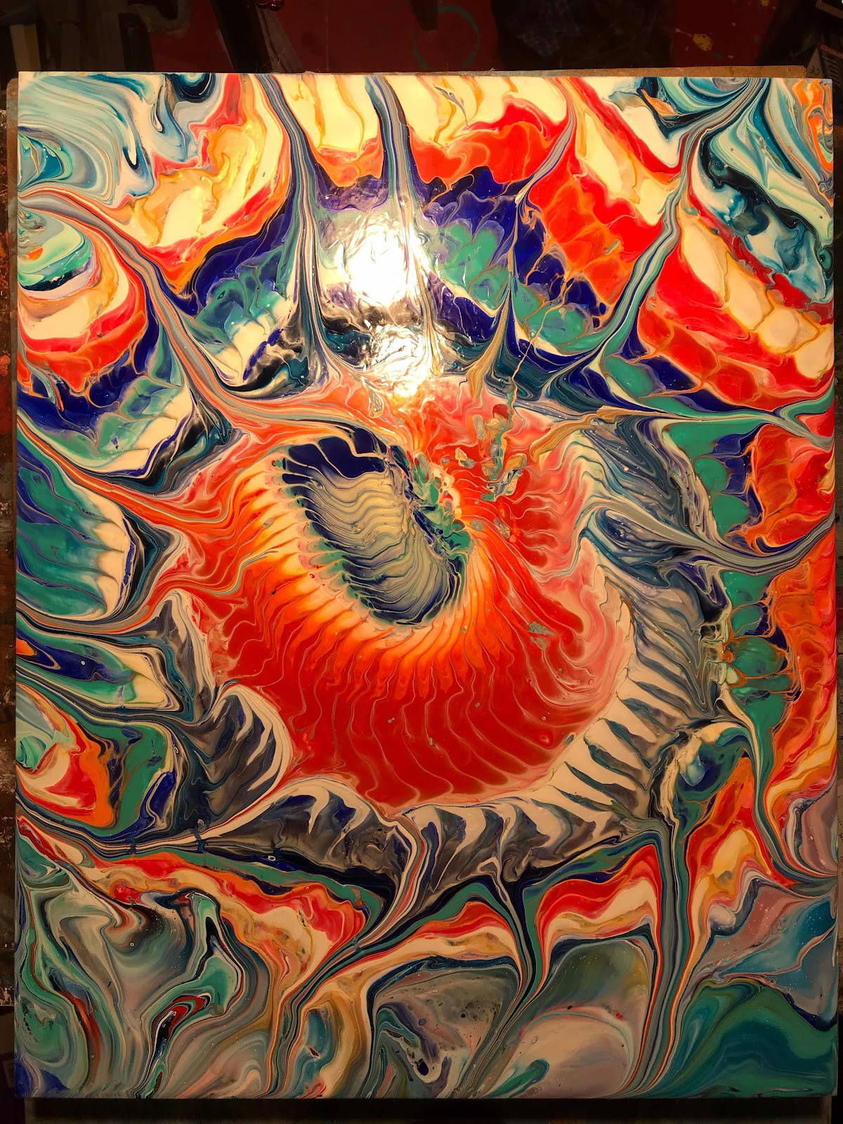
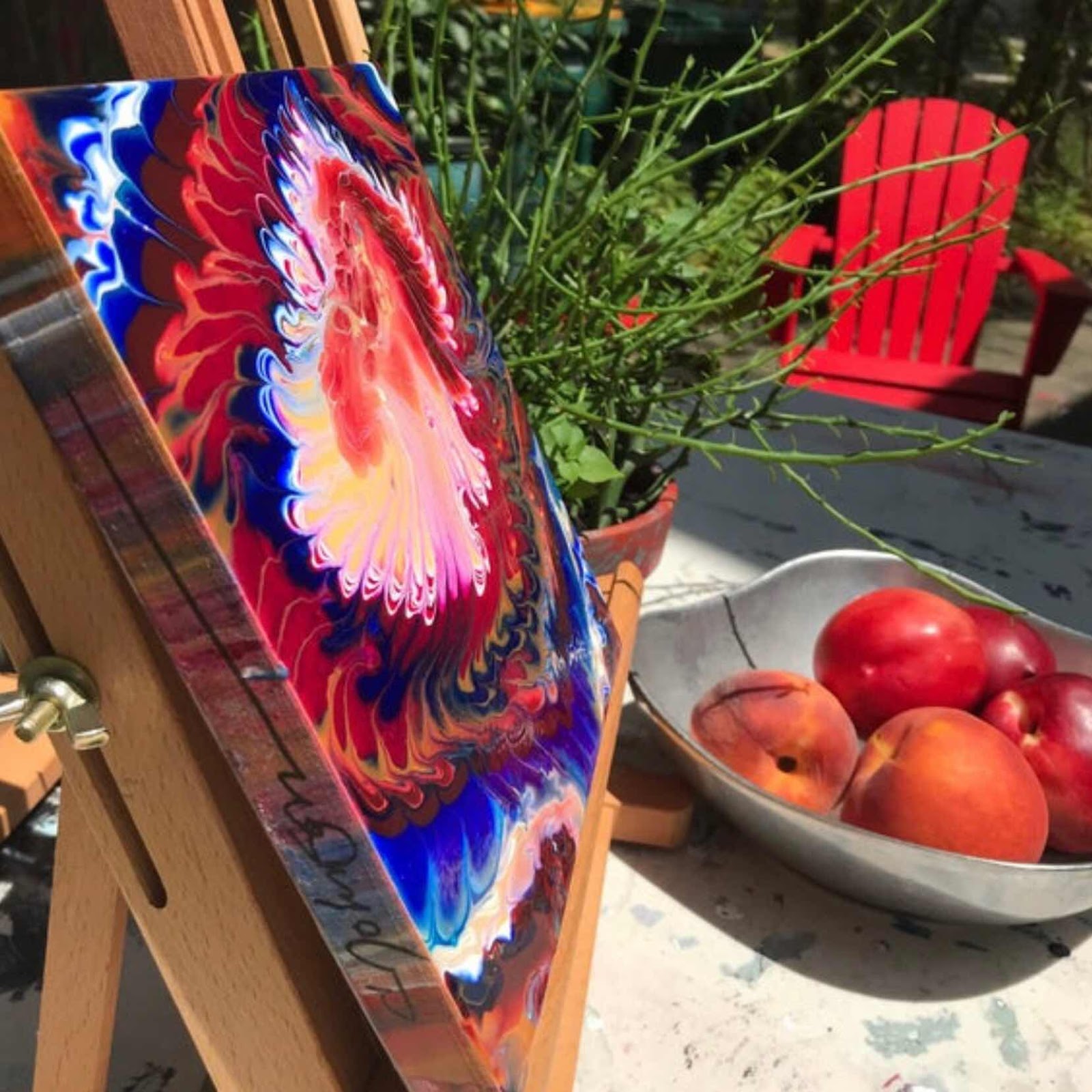
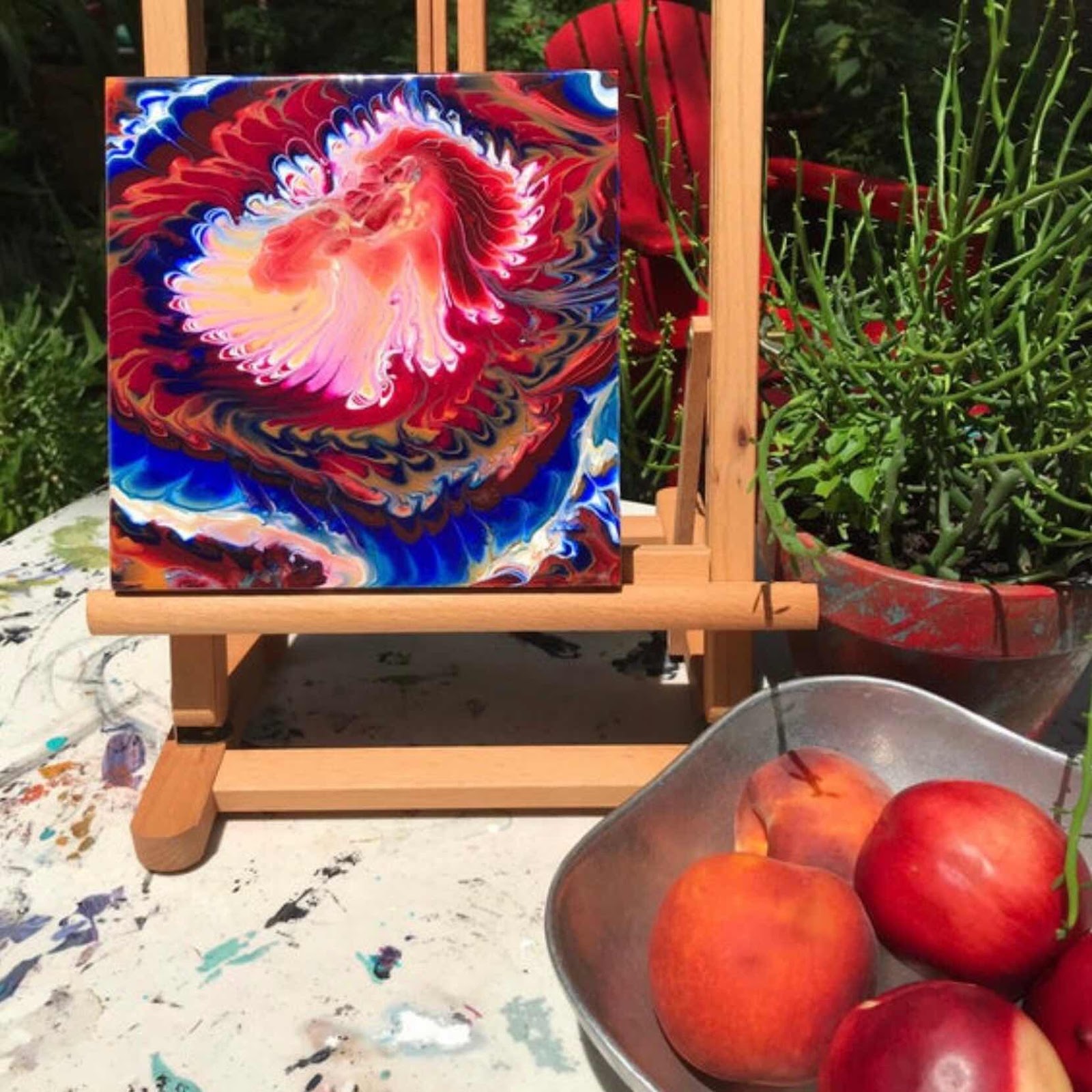
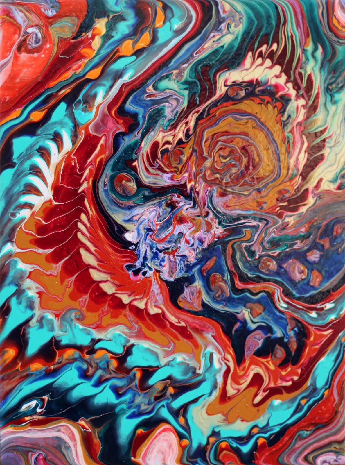
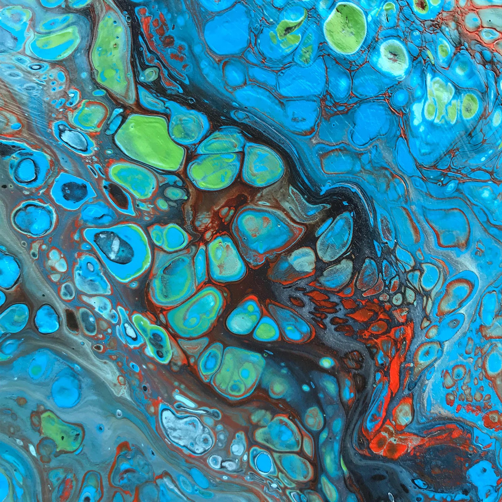
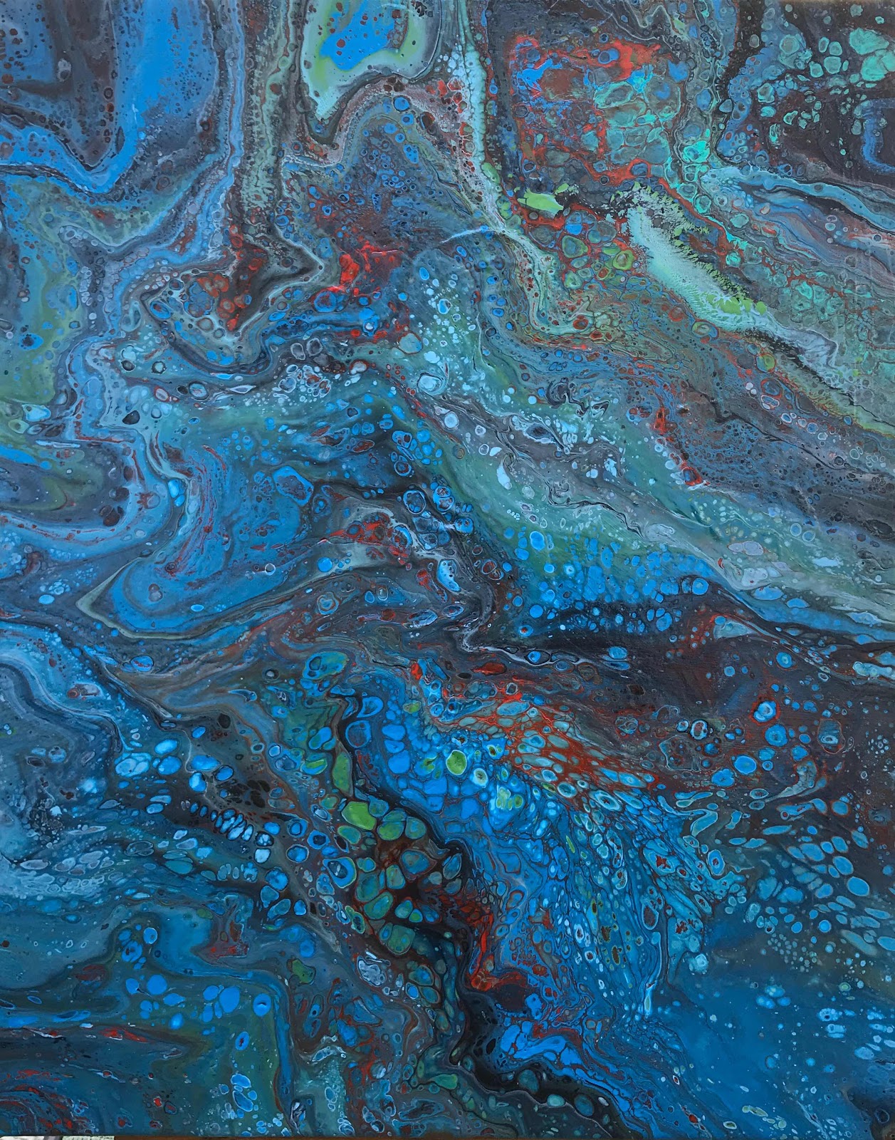
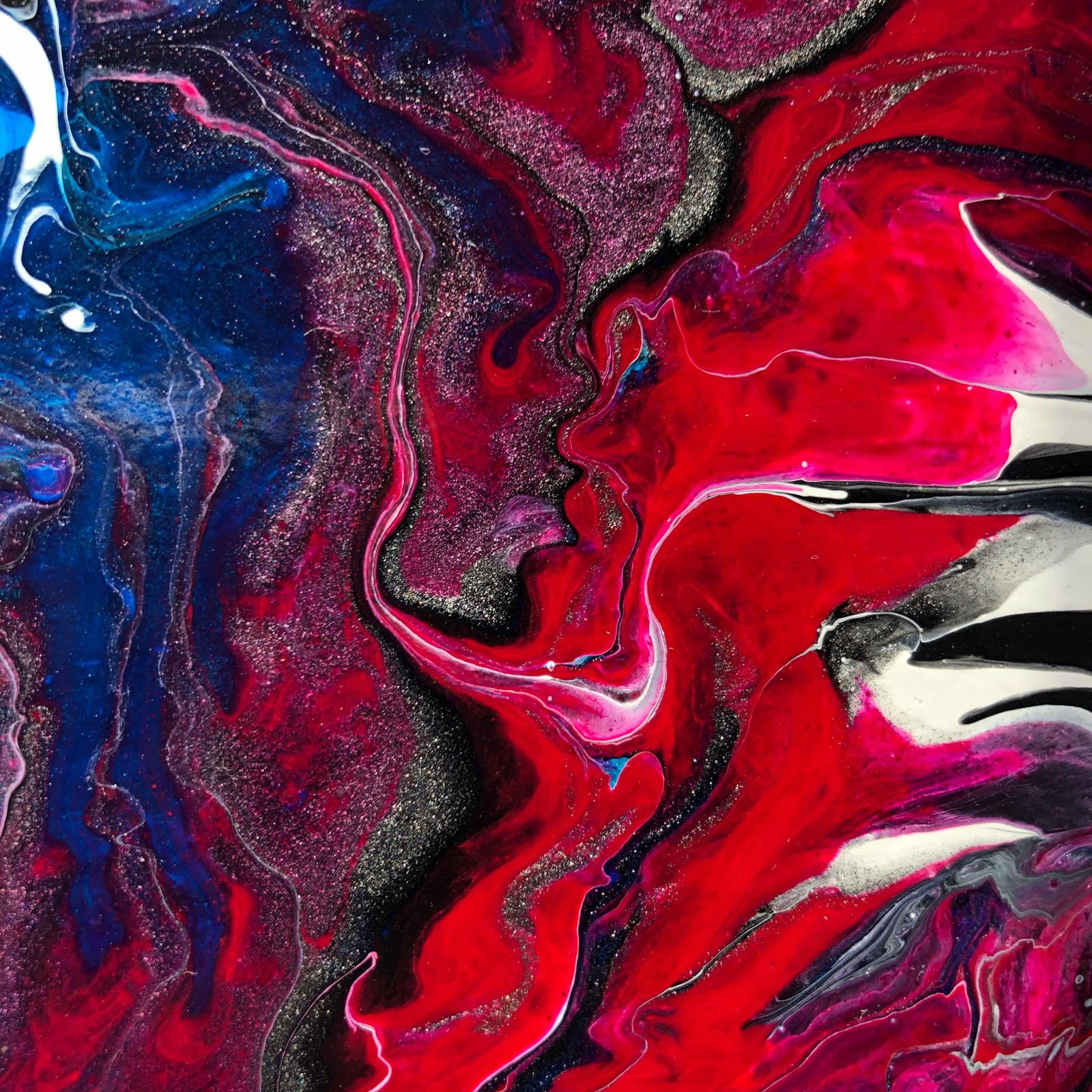
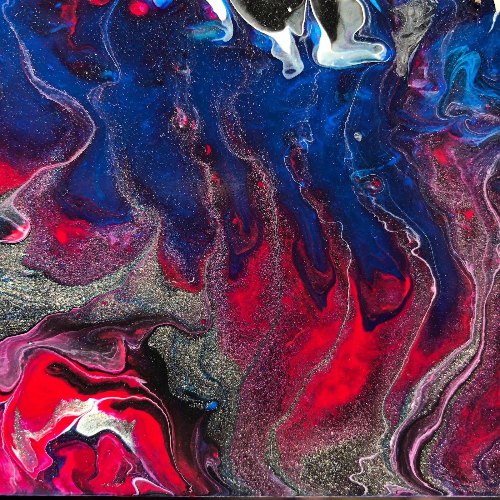
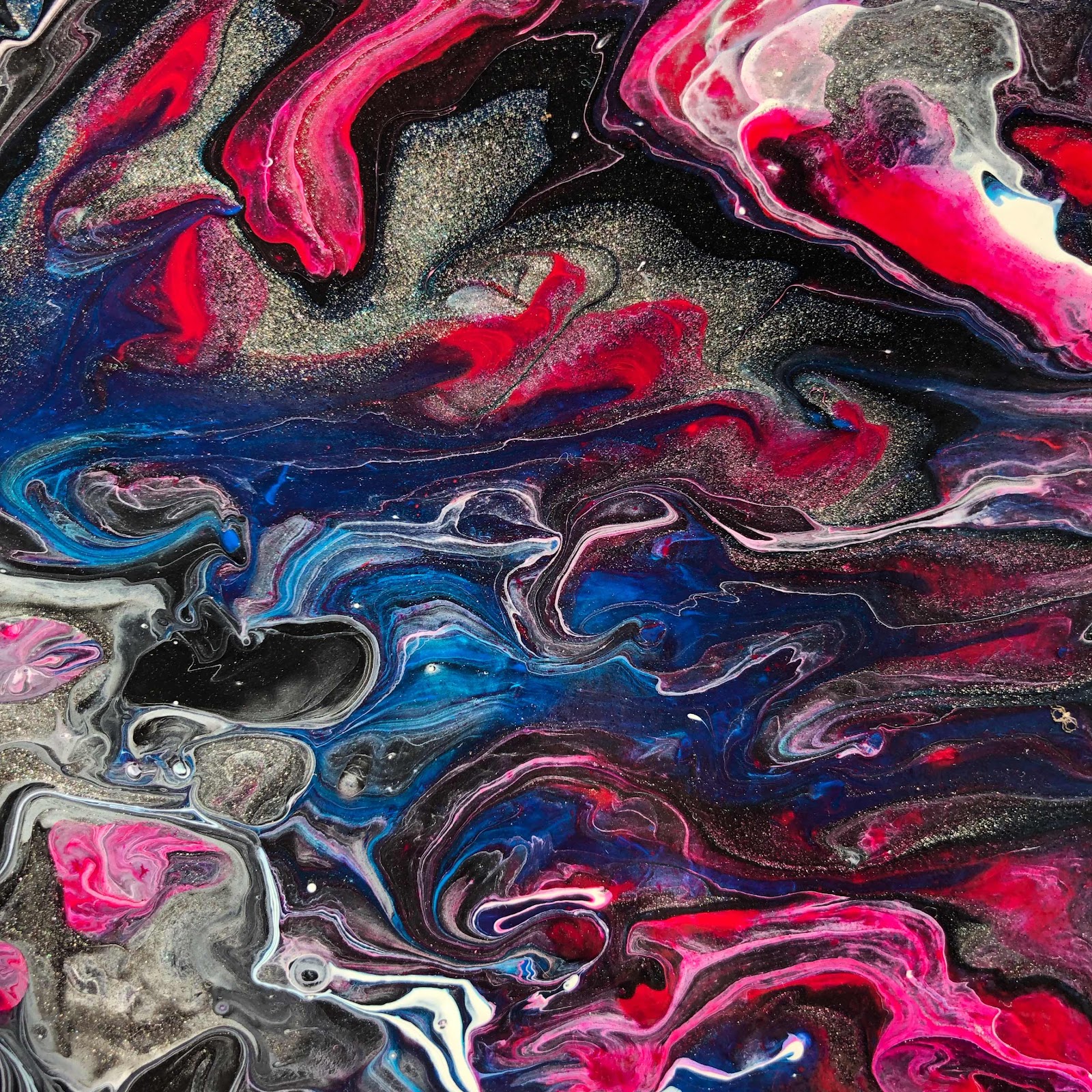
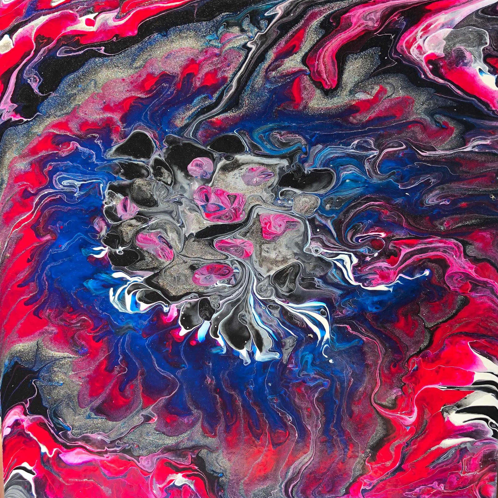
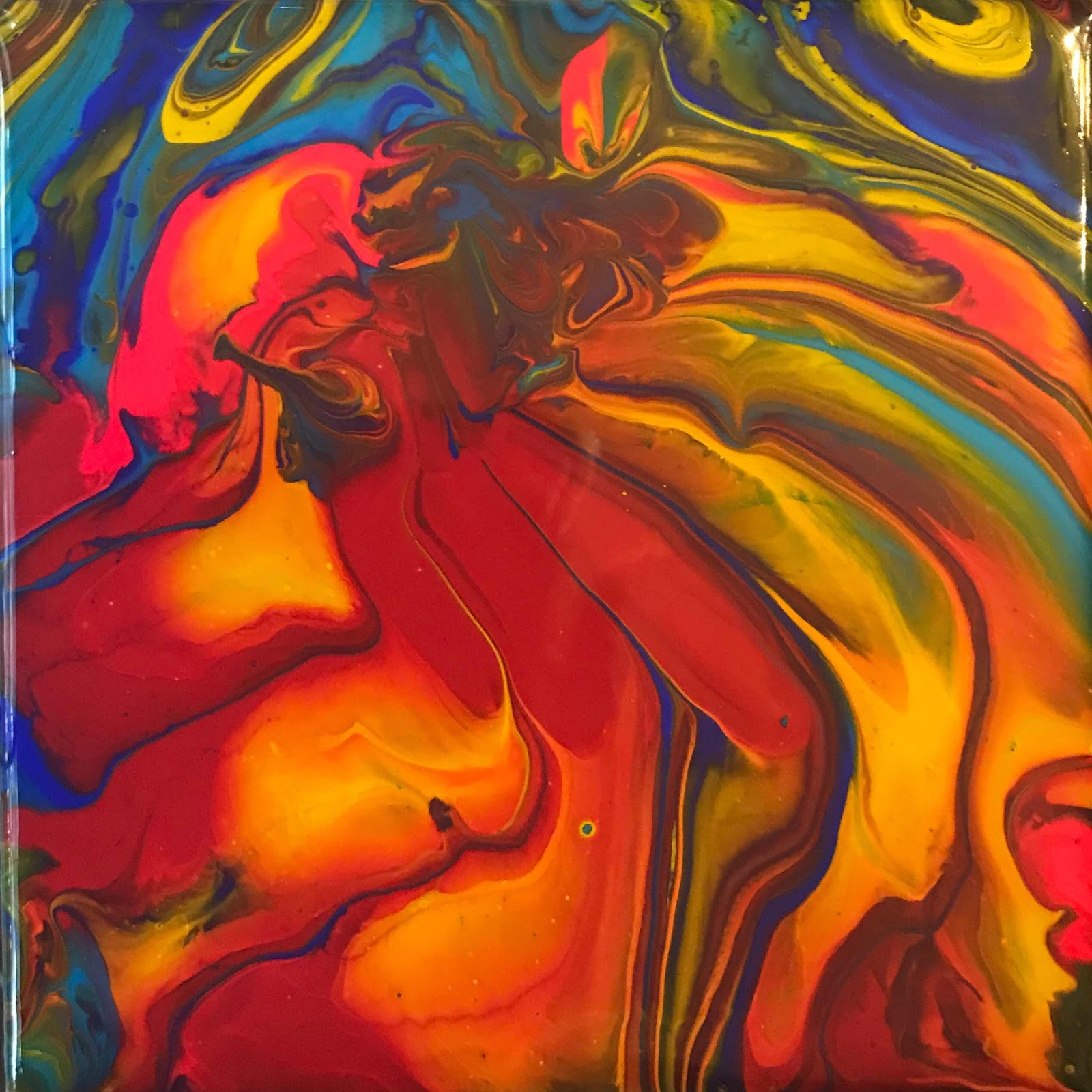
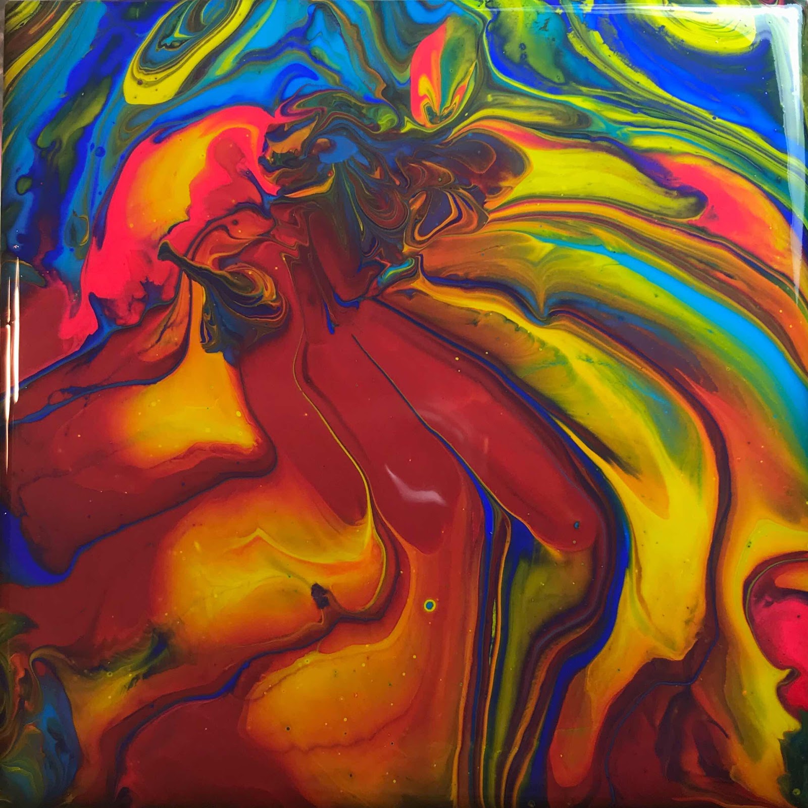
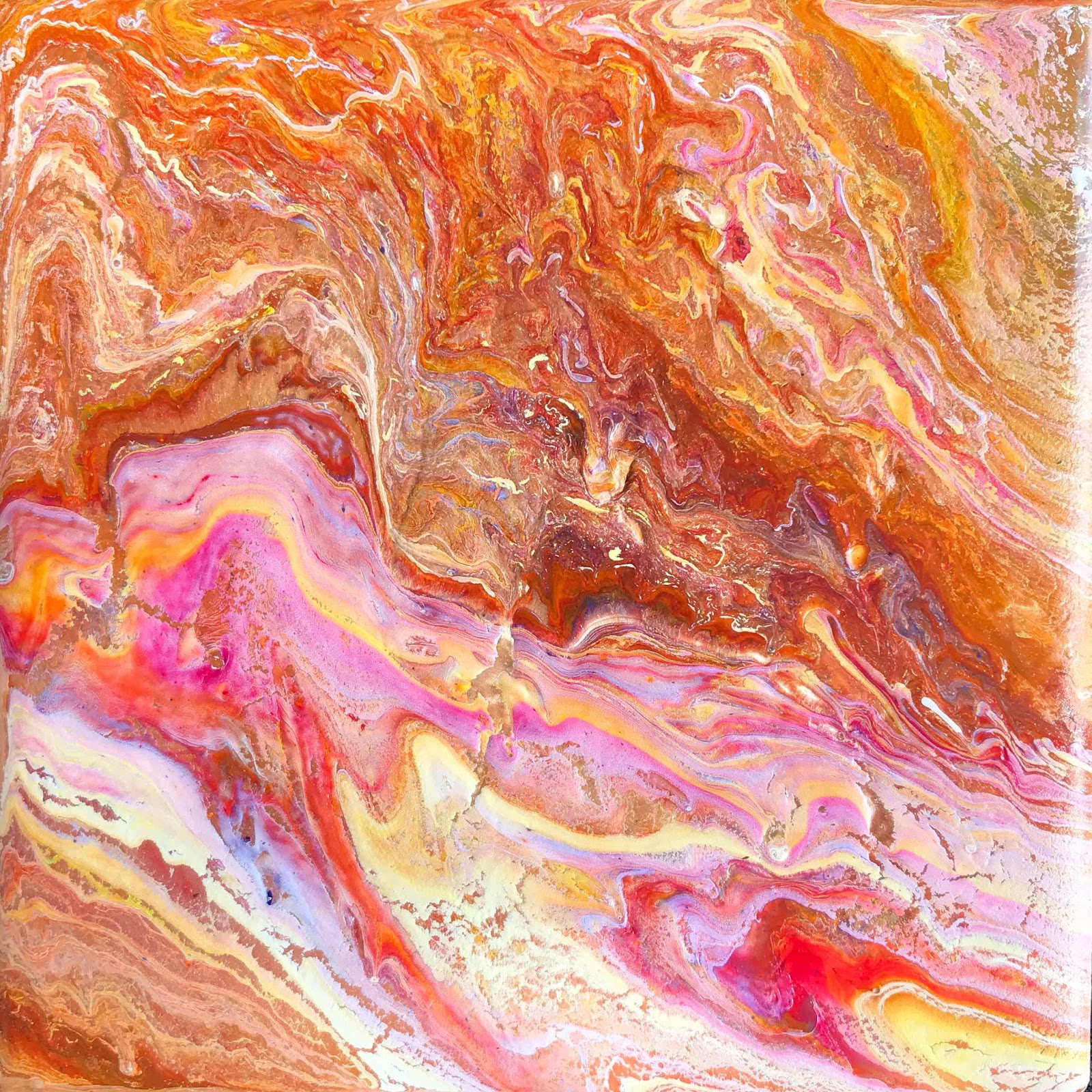
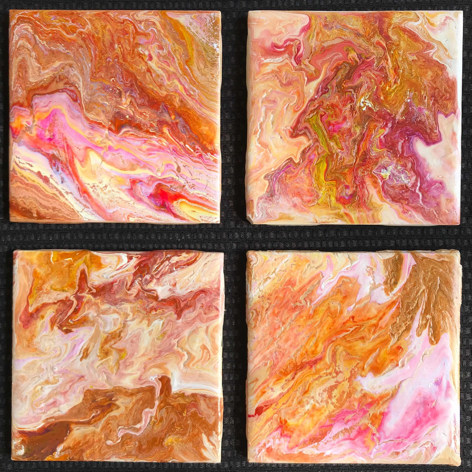
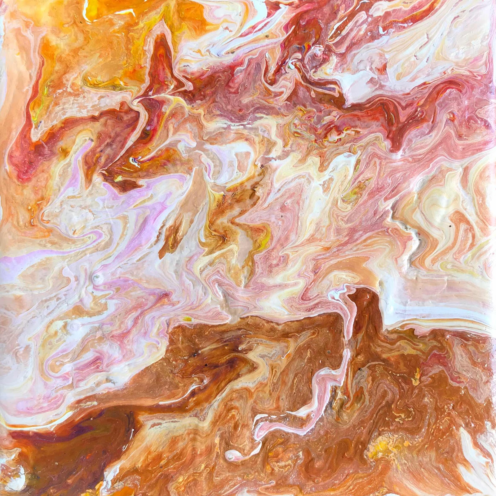
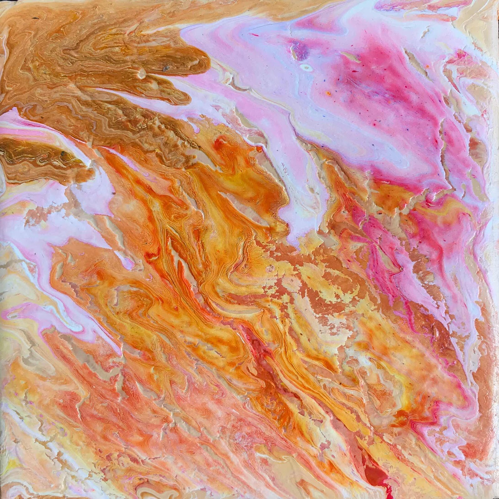
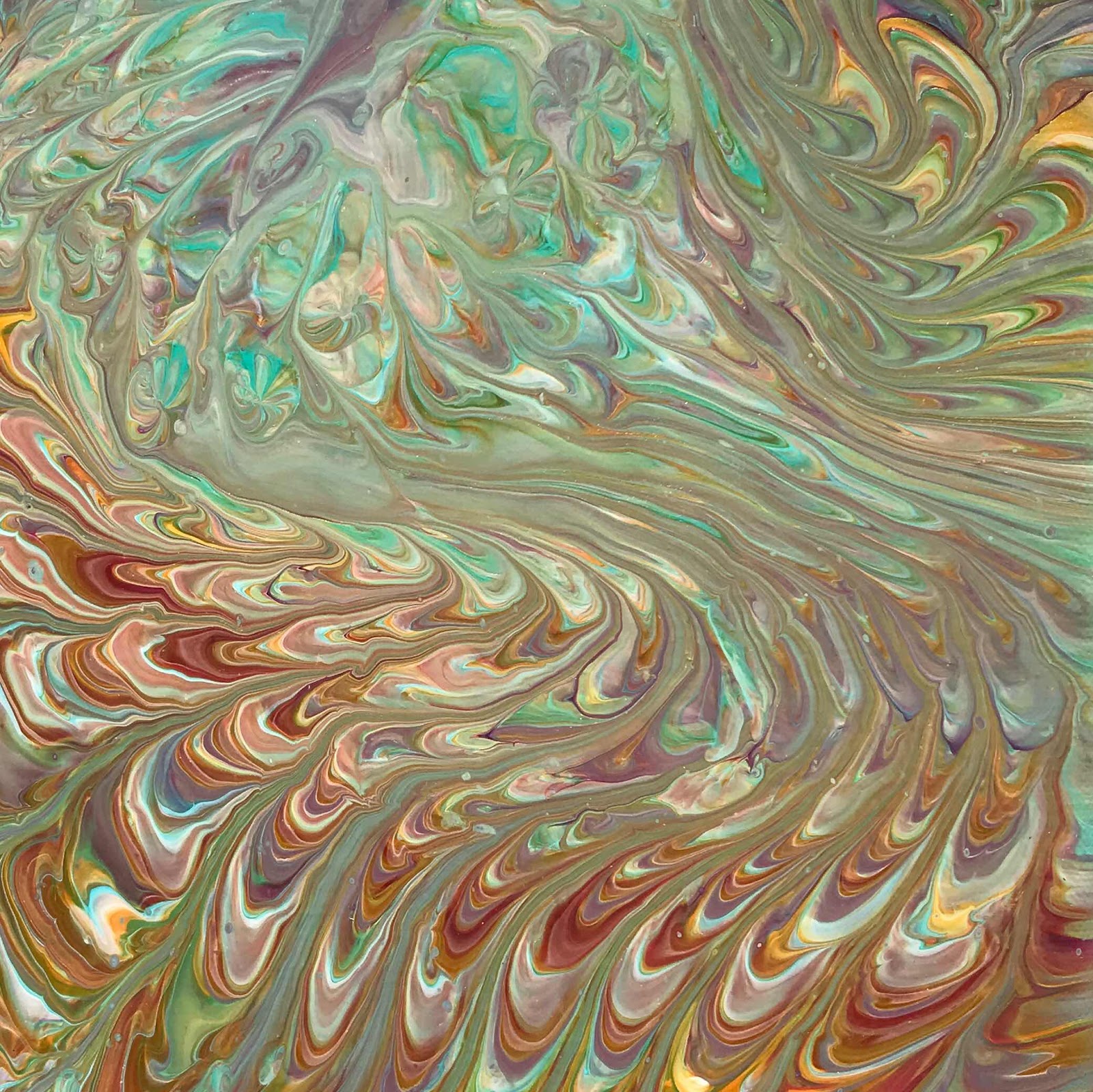
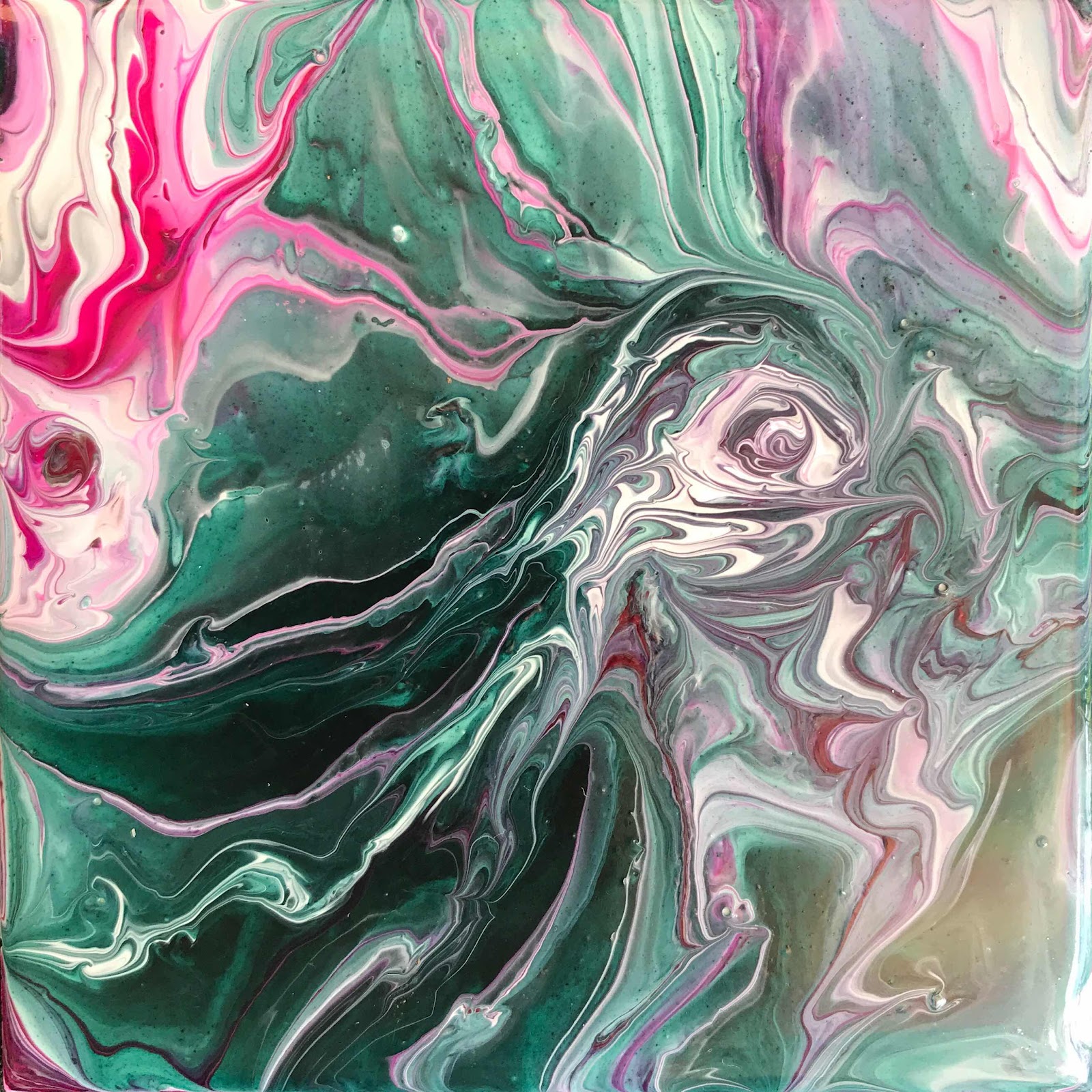
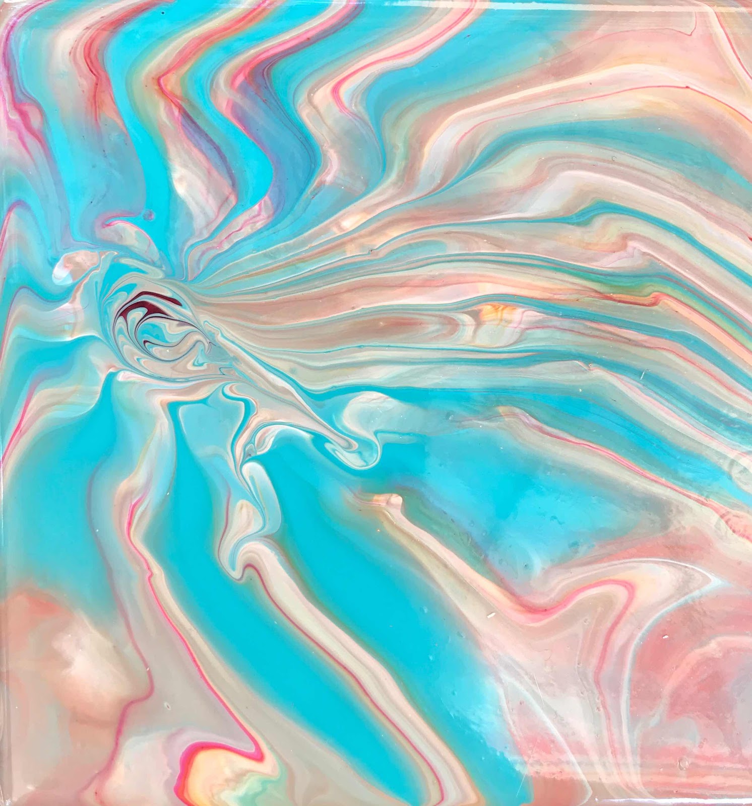
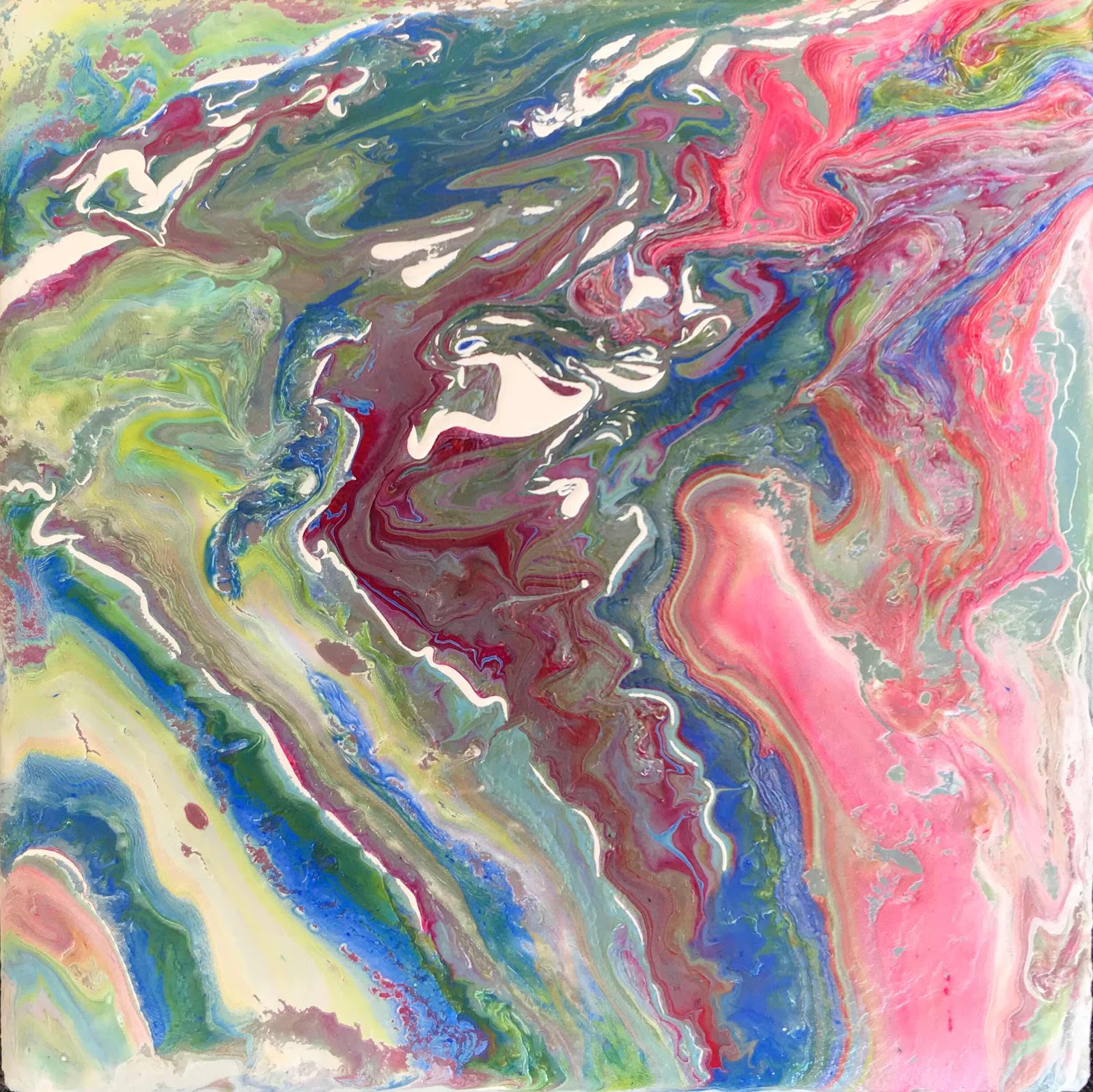
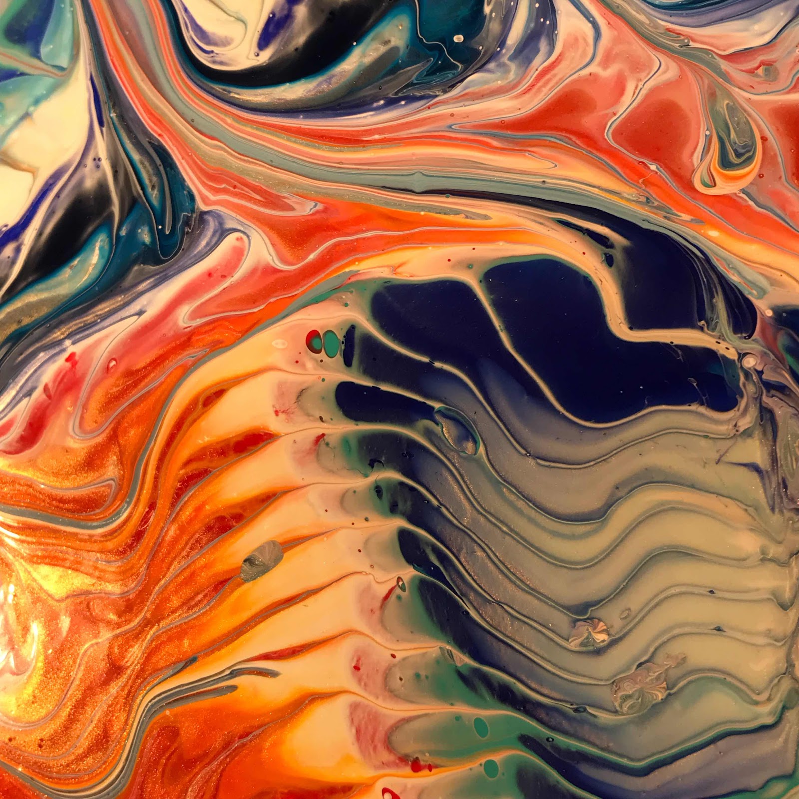
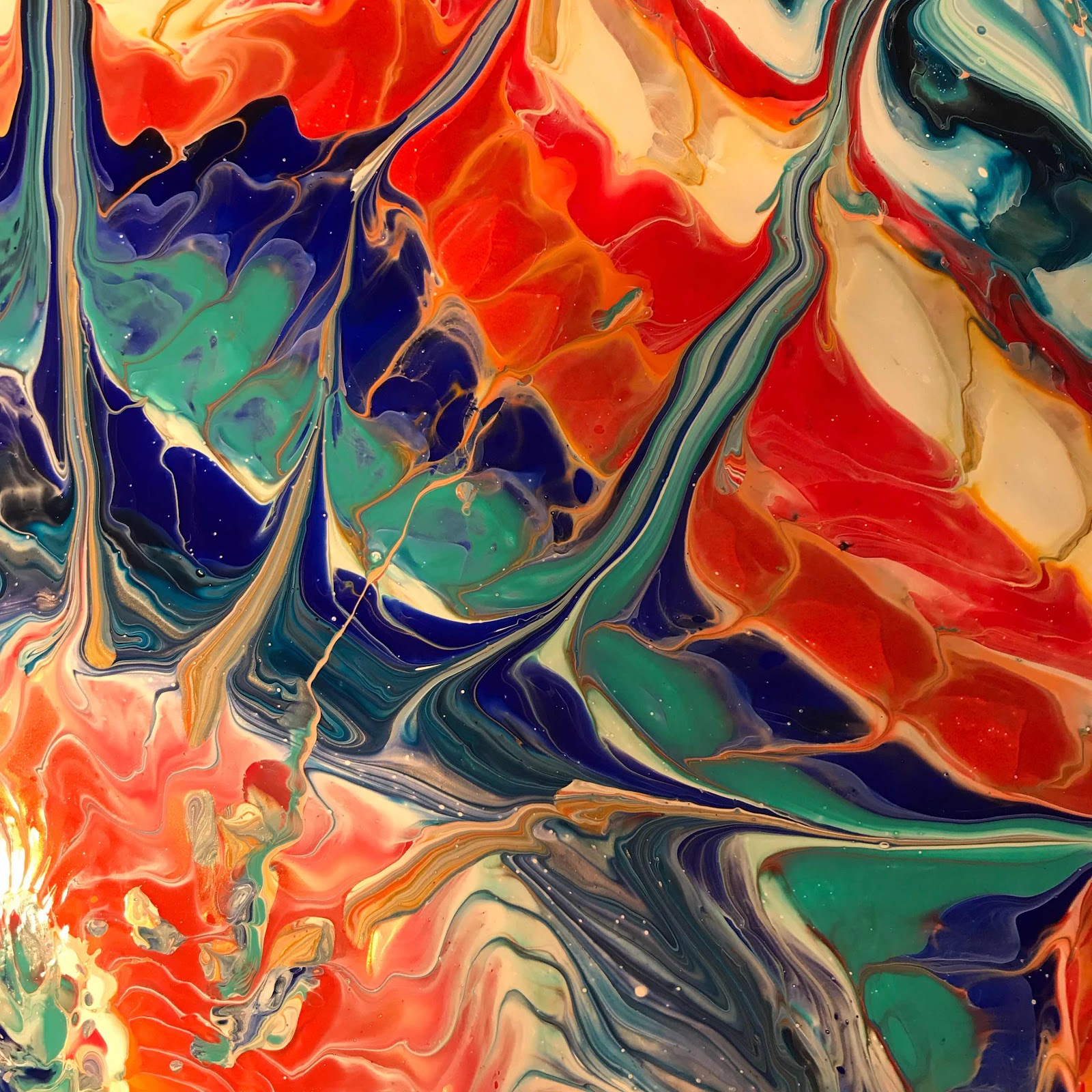
After the entire painting, here are some closeups:
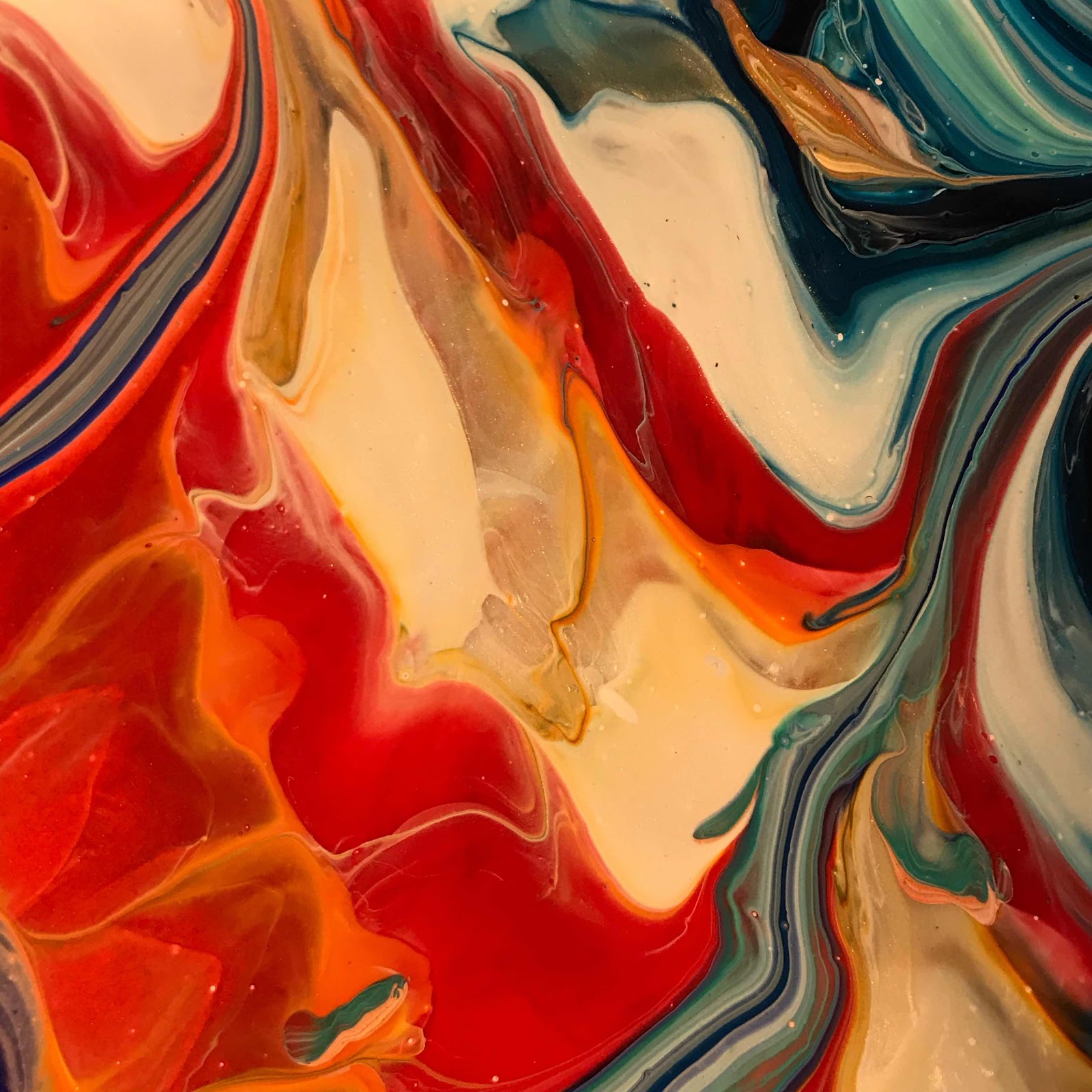
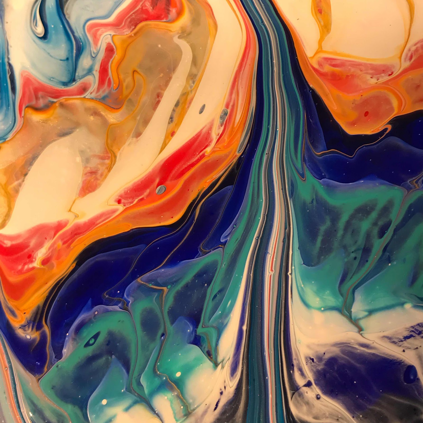
Oh my goodness, I love the way the colors meld and how you can see through the layers.
The above one, where it looks kind of grey, it’s really blues, whites and the iridescents that make it look that way from this angle.
I’ll be putting it up as soon as I get it wired. If you’re interested, let me know right away as I’m sure this one’s going to go fast!
SOOOO BEAUTIFUL!
Tuesday, August 20, 2019
Paint Pouring
Honestly, you guys, I think these things are bedazzling. I’m working hard on Christmas gifts and will be loading them onto my website soon. I am loving this closeup.
This has been one of the most difficult summers of my life. After shoulder surgery I really spent it all on physical therapy, shoulder care and trying to sleep. It’s been far too much for me to do my ‘normal’ painting, but these paint flows have been really therapeutic. Since I’ve pretty much dedicated my life learning to color, all I had to do was learn the rudiments of pouring and I’m pretty happy with the results.
Oh my goodness, isn’t this gorgeous? I ADORE the pearlescent paint mixed in! Sooo cool!
After a dry summer of creating almost nothing it feels really good to be able to turn out something that I think is beautiful. I hope YOU like them too! This last one is the entire painting.
Friday, August 16, 2019
Paint Pouring Art
Getting ready for fall shows and Christmas! These three photos show what different lighting does to a piece of art. Getting the true colors is always a challenge. But oh, man, I am loving this one so much no matter how it photographs!
Watch my website, www.colorcatstudios101.etsy.com for all manner of awesome, original gifts; there’s all kinds of wonder there and I will soon be adding every day!
Isn’t this just so cool? I’m making coasters, of which this is one, 6x6” squares for hanging, 10x10” squares for hanging y mas!
If I had to guess, its true colors lay somewhere between door #1 and door #2. #3 is leaning a little toward the blue side.
Friday, August 2, 2019
Paint Pouring Coasters
Because I’m recycling tiles, I decided to leave some of the grout from their previous life on them to give a nod to their past, acknowledging that we need to recycle. I’m curious what you think of this or would you rather have a perfect edge? I think of the Amish and how they purposefully put one piece of a quilt in upside down or just ‘wrong.’ Their aim was to point out that the only One who could do anything perfectly is God.
I really like that one. Here they are all together; notice the rough edges. I rather like it.
Thursday, August 1, 2019
Acrylic Pour Painting - WOW!
Wow, I am loving this paint pour! At 10” square, it’s a little piece that will just reel you in. You can find it for sale on my website. It’s on a 2” deep, heavy gallery-wrapped canvas. I’ve been working on these like crazy and found that they’re not as easy as they look, but man, this one. Love.
colorcatstudios101.etsy.com is THE place. :)Here’s a closeup of the painting:
Oh my goodness, it’s beautiful!!!
Wednesday, July 31, 2019
Paint Pour Coasters in the Works
I’ve been working on paint pouring, recycling old tiles to make coasters. I’m curious which one you like the best.
Please vote for numbers 1, 2, 3 or 4. This helps me decide on future works - thanks! I can get lost in the swirls and patterns - this girl needs a little help. I’ll be popping them onto my website in a month when I get them sealed, just in time for super cool Christmas gifts. :)
I’ve got a closeup of each one so you can get a good look at the swirls and colors...
I really like it that they’re on tiles that I’ve recycled. We’ve gotta help this world!
Oh man, I love the following one. It reminds me of sand and sea.
This last one is so cool! The colors and patterns are endless and just SUCK ME IN. :)
ANYWAY, check out my website colorcatstudios101.etsy.com for all kinds of goodies, and look for these in about a month. :) 👀