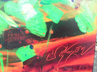
I took some close up shots of particular spots in the painting so you
could see how I put it together.
For this painting I used a big, flat two inch brush, because I wanted it to have a brushy, abstract look. It took some discipline for me on that part because I love my brushes.
These shots will give you some clues as to how the paint was laid down.
In some places I really spread the paint, especially on the lower layers, and in some spots I laid the paint down really heavily. In places I splattered dots and line, going back in places to cover the colors, and to have only the raised texture showing.
Complimentary upon complimentary.
With the clouds, I used a lot of acrylic gel medium to spread the paint out and slow the drying time a bit. I like the layers of color showing through one another, and enjoy the breezy feeling in the clouds.
This was somewhere in one of the trees. Once again, they asked for something that was somewhat abstract. The closer you look, the more abstract it becomes.
Close to the sun, I've got the light glinting through the leaves. To do this, I mixed the complimentaries, violet and yellow, to get a nice neutral color. My goal was to make it look as if the sun was showing through the leaves.
I think that might be the only spot in the entire painting where I did this; I agree with Matisse - he said he couldn't understand why artist mixed and muddied their colors, preferring the bright bold ones. Generally, I just lay them down, side by side. But in some cases, mixing for neutrals is just the right touch.
This is actually one of my favorite spots in the painting, but one of my least favorite photos - the colors fairly shout and dance with each other. However, it was impossible to get a true photo.
Oh, well. Got to see it in person.
There's nothing shy about this tree. Opposite colors shout at each other. I tell my students that complimentary colors are called that for a reason. They sit next to each other and say, 'hey, good looking, you're looking pretty fine today,' or '...wow - do you look good sitting next to me!'
Throughout the painting, I used a lot of acrylic gel medium. It allows you to see through layers of paint to the colors below them.
There is no black in this painting, although I went for some serious darks. I used indigo, which is a deep, deep blue/violet. It came across as black.
These colors came out pretty boldly, too - I went for colors close to each other on the color wheel - yellow, yellow-green, green, then blues to violets. The reds in the background pop out because they're complimentary.
Sooo. painting done. Now all we have to do is transport the panels and get them hung. I have a feeling that that in itself is going to be no small job!
.JPG)
For this painting I used a big, flat two inch brush, because I wanted it to have a brushy, abstract look. It took some discipline for me on that part because I love my brushes.
These shots will give you some clues as to how the paint was laid down.
In some places I really spread the paint, especially on the lower layers, and in some spots I laid the paint down really heavily. In places I splattered dots and line, going back in places to cover the colors, and to have only the raised texture showing.
Complimentary upon complimentary.
With the clouds, I used a lot of acrylic gel medium to spread the paint out and slow the drying time a bit. I like the layers of color showing through one another, and enjoy the breezy feeling in the clouds.
This was somewhere in one of the trees. Once again, they asked for something that was somewhat abstract. The closer you look, the more abstract it becomes.
Close to the sun, I've got the light glinting through the leaves. To do this, I mixed the complimentaries, violet and yellow, to get a nice neutral color. My goal was to make it look as if the sun was showing through the leaves.
I think that might be the only spot in the entire painting where I did this; I agree with Matisse - he said he couldn't understand why artist mixed and muddied their colors, preferring the bright bold ones. Generally, I just lay them down, side by side. But in some cases, mixing for neutrals is just the right touch.
This is actually one of my favorite spots in the painting, but one of my least favorite photos - the colors fairly shout and dance with each other. However, it was impossible to get a true photo.
Oh, well. Got to see it in person.
There's nothing shy about this tree. Opposite colors shout at each other. I tell my students that complimentary colors are called that for a reason. They sit next to each other and say, 'hey, good looking, you're looking pretty fine today,' or '...wow - do you look good sitting next to me!'
Throughout the painting, I used a lot of acrylic gel medium. It allows you to see through layers of paint to the colors below them.
There is no black in this painting, although I went for some serious darks. I used indigo, which is a deep, deep blue/violet. It came across as black.
These colors came out pretty boldly, too - I went for colors close to each other on the color wheel - yellow, yellow-green, green, then blues to violets. The reds in the background pop out because they're complimentary.
Sooo. painting done. Now all we have to do is transport the panels and get them hung. I have a feeling that that in itself is going to be no small job!
.JPG)
.JPG)
.JPG)
.JPG)
.JPG)
.JPG)
.JPG)
.JPG)
.JPG)
.JPG)
.JPG)
.JPG)
No comments:
Post a Comment