Friday, January 6, 2012

Closeups on Dragon Series

 Here are a few closeups that I promised in the previous posting showing my dragon series.  It's a little difficult to tell, but if you're looking at it in person, you can see several layers which give it more dimension.
This one is part of a sky/tree section. I really like it as it gives me a feeling of a beautiful, breezy day.
I've melded together a lot of greens and aquas along with some iridescents and golds to give this one a dreamy quality.

Well, the colors are bad because I'm not a great photographer, plus I took these shots with my phone.  Am I making excuses?  YES!  Anyway, these colors lean towards greens, aquas and blues on this particular painting.
I used iridescents on the water coming from their mouths, as you can see here.  If you click on any one of these pictures, you can get a closeup.


And this, the last shot, gives you a feel of paint flow.  I like it when I find a sedimentary ink that reacts to other inks as shown here.  Or maybe it's magic.

Thursday, January 5, 2012

East Shore Dragon Series

Okay, here is the series I promised to show.  In my previous article, I showed the photos I took to inspire me.
All of these are woodblock prints, but are completely individual members of a limited set of six.
My first job was to draw out the dragon.  This I did on cheap newsprint or something like that.  Then I did the highly technical operation of scribbling on the back of the paper with an ebony pencil, laying it down on the woodblock, and tracing over my work.  Instant copy, right on the wood.  Then I realized I had done it backwards, because I wanted the final dragons to be looking from left to right.  Remember, the image is inverted when you print.  Well, I didn't remember, so it turned out to be a joke between me and my students.  AND... I had to retrace and redraw it!  Oh, brother.

While I was carving the dragon, I worked on the backgrounds separately, so everything would be done at the same time.  I used my experience with lakes to inspire me. 
This first dragon is called 'East Shore Calm.'  I like the calming, cool feeling it gives me.


This dragon is called 'Keeper of the East Shore.'  I used the trees across the lake and the beautiful fresh sky to inspire me.  Note that you can see the colors through the dragons.  That was very important to me as I like the textural interest that brings.  We won't even talk about the pics I had to toss because the paint was too thick or too thin.
The next one is 'East Shore Dragon.'  Love the colors in it and the deep water feeling it gives me.

 The next one, with the dashes of red, is called 'East Shore Guardian.'  It's the only one with any reds in it, and I like it because of the way the complimentary colors work together.

The last one I named 'Dragon of the East Shore.'  The colors are really vibrant and bright.  I paint on YUPO, which is a 100% polypropylene paper.  Because of this, it's completely nonabsorptive.  I use colored inks because of their vibrancy, and they sit on top of the YUPO without soaking in at all.  The result is
 extremely bright jewel tones.  It's really difficult to paint on, but the tradeoff is extreme fluidity, an unexpected depth, and hopefully some nice, controlled surprises along the way.
I'm selling these for $300.00 each, and just framed my first one and put it in the gallery this week.
In my next entry, I'll give you some closeup looks at these works.


Dragon Paintings - Initial Photos

I just finished a series of paintings which these dragons inspired me to.  As an artist, I appreciate beauty in many forms, and will often take a detour if I know that it's a 'scenic route.'  On the east shore of Lake Woodlands, which they imaginatively named 'East Shore,' are several dragons dribbling water into the lake.  I love them, and now and then will stop to see them, enjoy the lake and have a little chat with my friends.  Here they are.
I had a nice woodblock just waiting for me, and one day while driving past my dragons,  realized that this was what I wanted to do!  I parked and walked over to take these shots.
In my next entry, I'll show you the paintings I just finished.


Friday, December 2, 2011

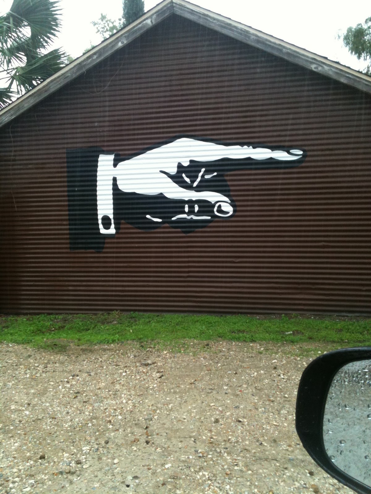
Where to Go

Found this one downtown the other day.  I guess we all know where to go now.

Friday, November 25, 2011

Thanksgiving Breakfast

There are such a great number of things for which I am thankful this Thanksgiving.  Among the myriad of blessings, a lingering breakfast poolside of pumpkin pie and berries along with a nice black cup of Cuban coffee rates very high.  Add in my Bible and an art magazine along with that whipped cream and it made for a very special breakfast indeed.  Thank you, God, for all of your blessings!

That was yesterday.  I didn't mention that I wrapped up in a quilt and hugged my coffee - it was in the mid 50s.  Today it's headed toward 75 so we were out there in shorts.  Yesterday was a good day for cool weather - we went traipsing through the woods and brought home about 1/3 of a cord of wood for winter fires. I love it when we don't have to buy firewood - we spent only muscle power.

Wednesday, November 23, 2011

Studio Peek

 One of my favorite things to do besides looking at other peoples' artwork is looking at other peoples' studios.  With that in mind, I thought I'd let you peek into mine - well, a little corner of mine.
Here's the desk I paint on.  I gave up trying to keep it clean a long time ago, that was a battle simply not worth fighting.  Liquid acrylics dry really fast, so when I'm painting, it ain't over 'till it's over.  By then it's dried on all surfaces around me, too, i.e., wall, carpet, small children... you get the idea.
Because I carve woodblocks I need a place to create my prints where things are squared up.  I've laid the tape down so I can quickly align things when the paint is wet and I have to work fast.


Perhaps some of you have the same problem I have - lack of space.  My over-the-door shelves have helped a lot in that area for all my tiny bottles of liquid acrylics and inks.  Unlike my kitchen cupboard, I've got them all categorized into colors, neutrals, and type.
On the top shelf you can see a collection of my little purse sketchbooks.  They continue to be my idea-cookbooks and I pull them out now and then to spark creativity.
Now that I look closely, I see where that roll of 1" masking tape has been hiding.  Found ya!


Monday, November 21, 2011

Student Self Portrait

Last week I taught facial proportions and expressions to one of my youngest classes.  We also discussed putting things in with your self portrait that help express who you are, either in words or pictures. 
This is a self portrait one of my eleven year old students did.  Love, love it!
I particularly like the way she set herself apart from the background and worked with her negative space.  One talented girlie!
And who doesn't like ice cream, anyway?