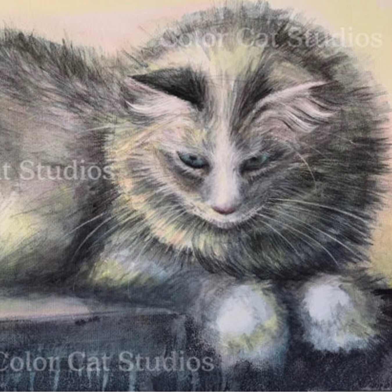
Note: This is literally half of the painting. The other gorgeous half is on my website noted above. Wink wink.
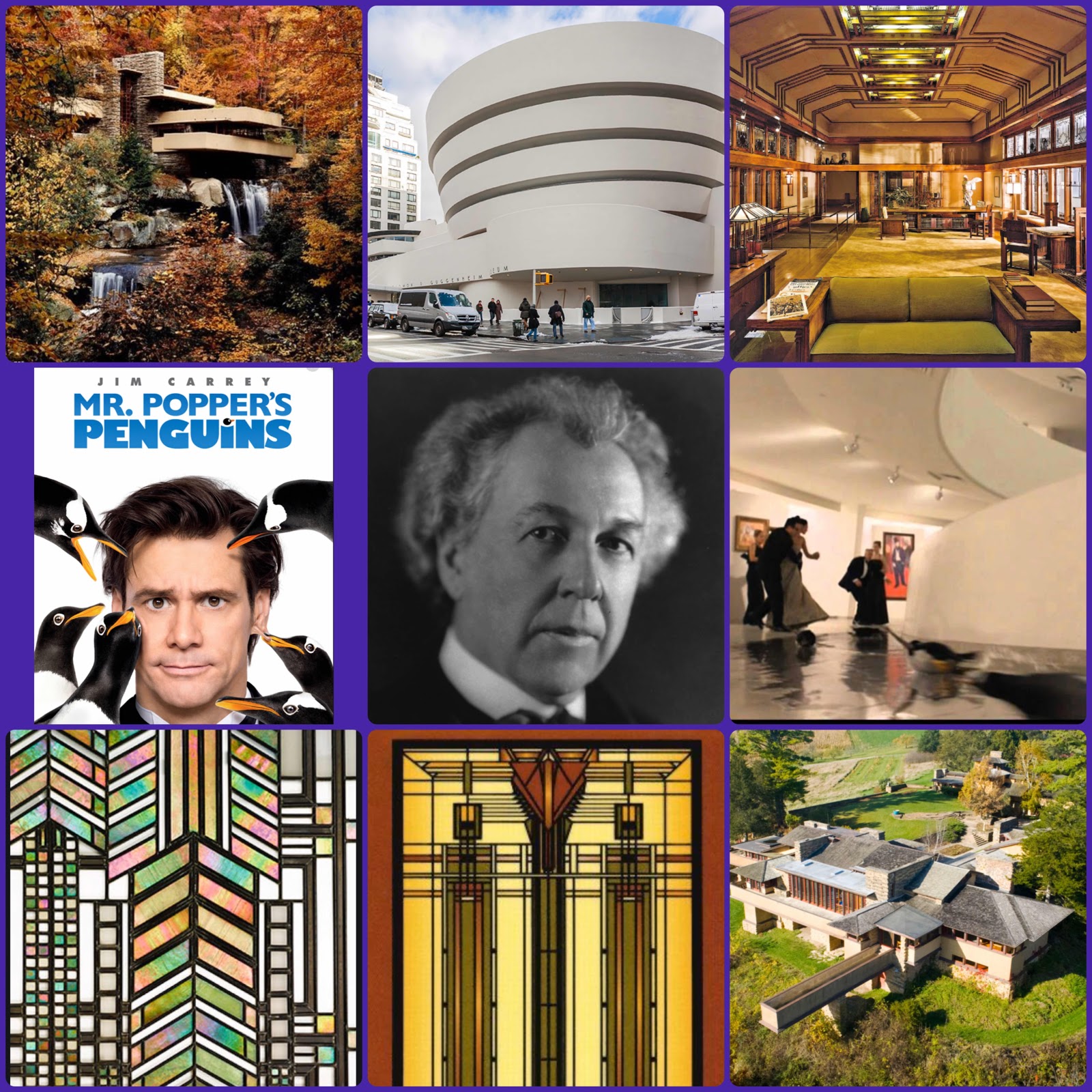
I’ve been showing my art students Frank Lloyd Wright. He’s reputed to be the greatest American architect that ever lived and looking at his work, I believe it! His influence has stretched to the present day. He designed buildings to fit into their environment and opened up rooms so that they would flow together. He did away with the tiny rooms and small windows of your childhood. Not content with just any windows, he designed his own (often with leaded and stained glass) and also designed lamps, furniture - well, everything inside the buildings as well!
And Mr. Popper’s Penguins? They cavorted in the Guggenheim in NYC, Frank Lloyd Wright’s design. Cool!
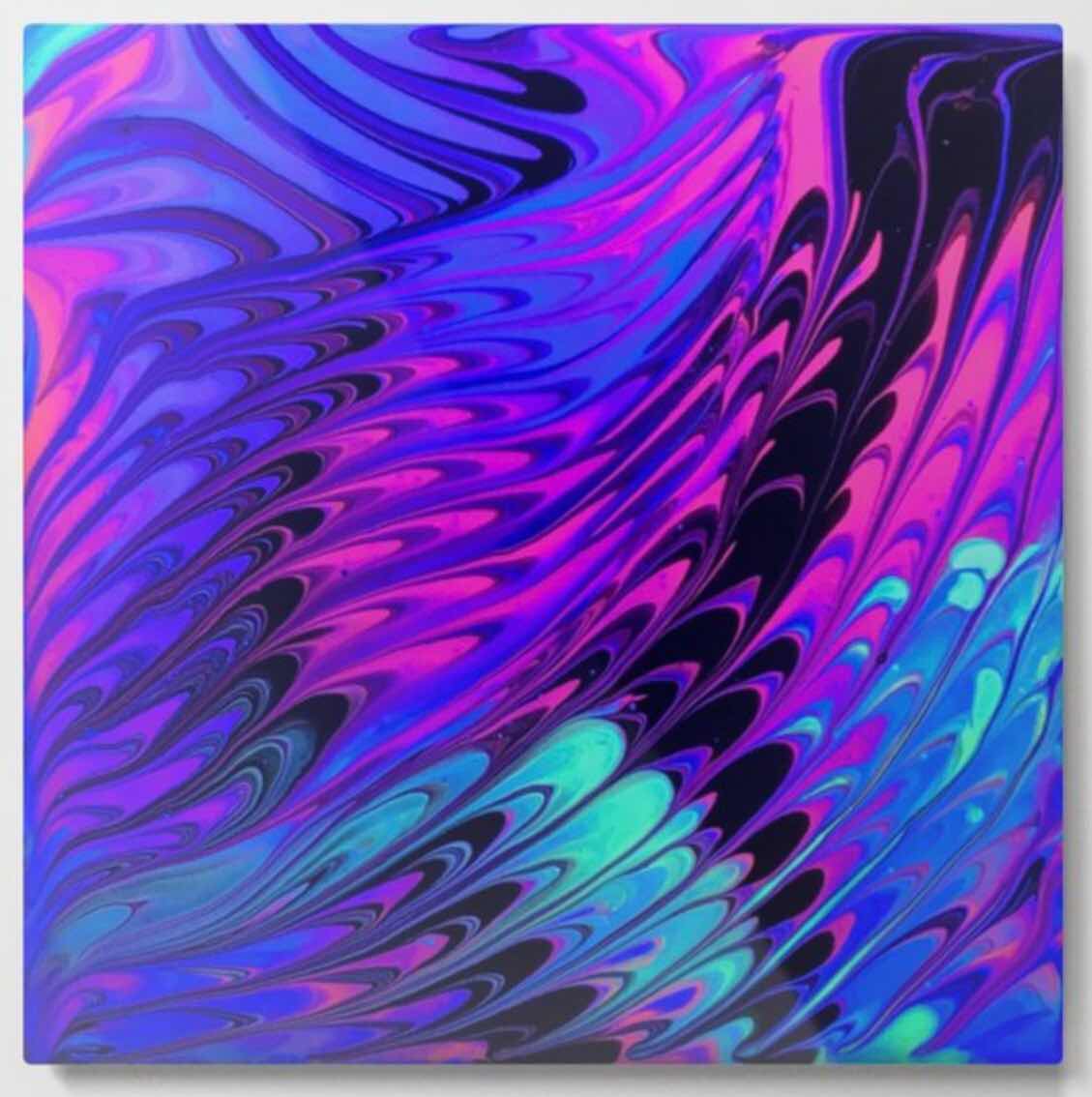
This beauty is one of my creative loves - metal embossing. Done in layers, I first painted the wood with those nice flowing textures. Once I embossed the metal I gave it that nice patina and laid it on the wood. Once set I put a layer of heavy gel over all as a sealant, and drew textures to echo the metal and signed my name into the gel, so this piece actually has a double signature, seen and unseen. The finishing touch was the turquoise patina around the edges of the wood to bring it all together. Rich and deep!
This piece is on cradled wood and is approximately 12”x12”. It’s on my website, colorcatstudios101.etsy.com
Here is the floral pattern I’ve been working on in my studio. Inspired by my big, red hibiscus. Thinking I’d pick up a backpack if it had this pattern. Would you?
This could work for all kinds of things - cushions, drapes, and anything for the interior. That would be one cheery room! I would love to have this in a room filled with light and plants and wicker.
My dilemma as I was working was to keep it simple. As any artist works, there are so many decisions to make.
I had to fight my desire to paint the background (all white) either a deep blue or black. That would be showy and nice, but I wanted to keep this one light.
Because watercolor is such a fresh, immediate medium, I also had to fight the desire to ‘finish’ it by adding details in the flower centers and leaves. I felt that would detract from the beautiful bleeds and bloomed of the watercolor movement and flow. It might have erased it and covered it altogether!
Another decision was to NOT add darks for shading and dimension. I wanted to keep it slightly flat. Also to add the shading would have opened up the possibility of overworking the painting.
I think these were all good decisions. In fact... I like it! :) Do you?
This floor.... you know, most of us don’t recognize the artistry that goes into the everyday products that surround us. I was captivated by these tiles and they inspire me in all kinds of ways. Yes, that rolling suitcase is paint-splattered and I think it is downright awesome.