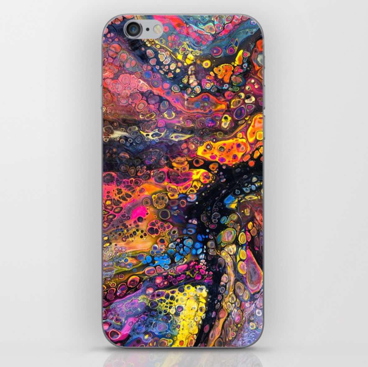
You can find my design printed on metal, canvas and all manner of lovely things. 20% off TODAY!
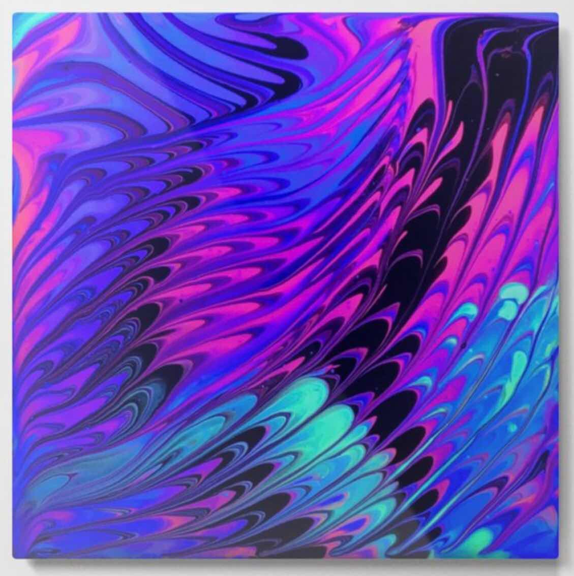
Oh my GOODNESS! iPhone and Galaxy people, how would you like my artwork on your phone case? Society6.com; search Color Cat Studios. Wow. I am LOVING this. Pretty sure we all need new cases. Love these!!!!
www.society6.com is where you get ‘em!
I’ve done quite a lot of layouts, always in a single color. This time I decided to celebrate the color wheel and just lay down those colors (sorry, purple, I owe you one.) Of note, gorgeous ribbons one of my students gave me on a cool gift, my metal embossed seahorse mounted on a box and a colorful swag I recently made which I toss over all kinds of things to brighten things up and celebrate. Oh, and my coolest ever striped purse from Target. And my cheap sunglasses. (These be no rhinestone shades.)
Here is the floral pattern I’ve been working on in my studio. Inspired by my big, red hibiscus. Thinking I’d pick up a backpack if it had this pattern. Would you?
This could work for all kinds of things - cushions, drapes, and anything for the interior. That would be one cheery room! I would love to have this in a room filled with light and plants and wicker.
My dilemma as I was working was to keep it simple. As any artist works, there are so many decisions to make.
I had to fight my desire to paint the background (all white) either a deep blue or black. That would be showy and nice, but I wanted to keep this one light.
Because watercolor is such a fresh, immediate medium, I also had to fight the desire to ‘finish’ it by adding details in the flower centers and leaves. I felt that would detract from the beautiful bleeds and bloomed of the watercolor movement and flow. It might have erased it and covered it altogether!
Another decision was to NOT add darks for shading and dimension. I wanted to keep it slightly flat. Also to add the shading would have opened up the possibility of overworking the painting.
I think these were all good decisions. In fact... I like it! :) Do you?