Thursday, August 29, 2019

Paint Pouring Painting - ‘Rising’

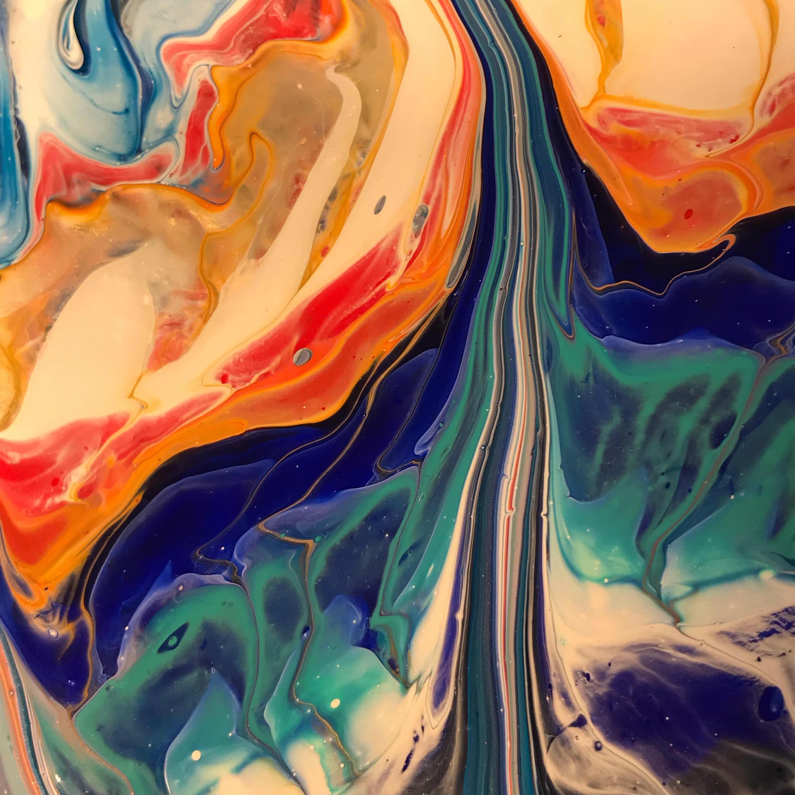
You know, I began doing paint pouring in response to my shoulder surgery, which left me unable to mentally focus long enough to produce my ‘normal’ style of art.  But it’s become more than that.  The beauty of these works really moves me in a way that’s hard to describe.  Here’s the entire painting:


It’s also a huge challenge to get one of these to turn out and many I end up painting over.  But this one.  I call it ‘Rise,’ because for me the paint rises up like a stem of gladiola flowers.  The fact that there’s a little elephant in with the flowers I guess is just a bonus.  Do you see him?  He’s in this following picture:


Aw, goodness.  He looks like Dumbo. ❤️ Oh, the prettiness never ends with this one!


I just popped this on my website last night.  Believe it or not, these are ever so much more beautiful in person, with their deep, glossy colors.  You can find this painting and many others at www.colorcatstudios101.etsy.com. 

www.colorcatstudios101.etsy.com
Oh, goodness, I’m in love all over again!


Wednesday, August 28, 2019

Dragons Among Us Painting

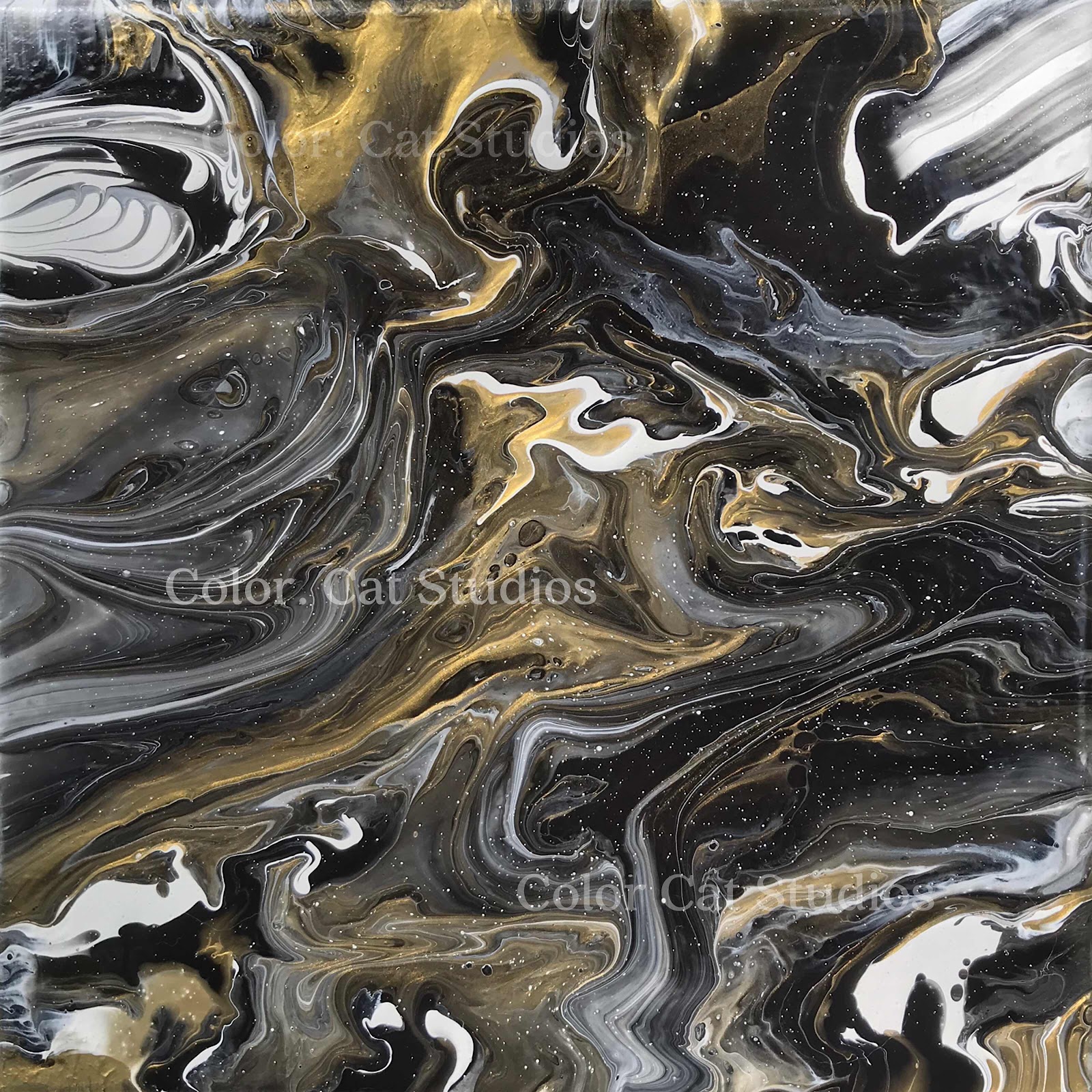
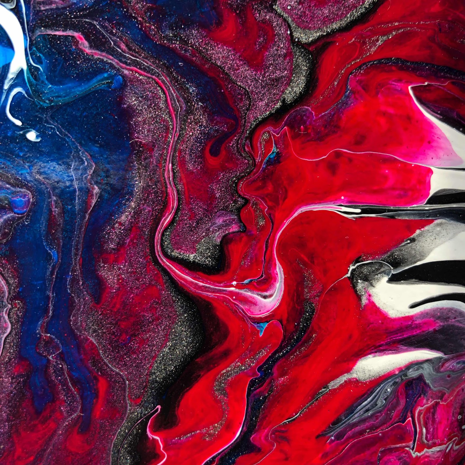
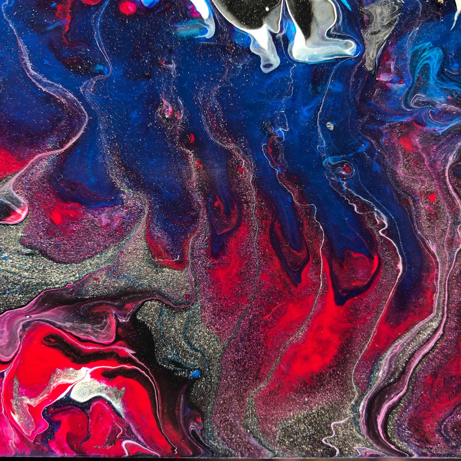
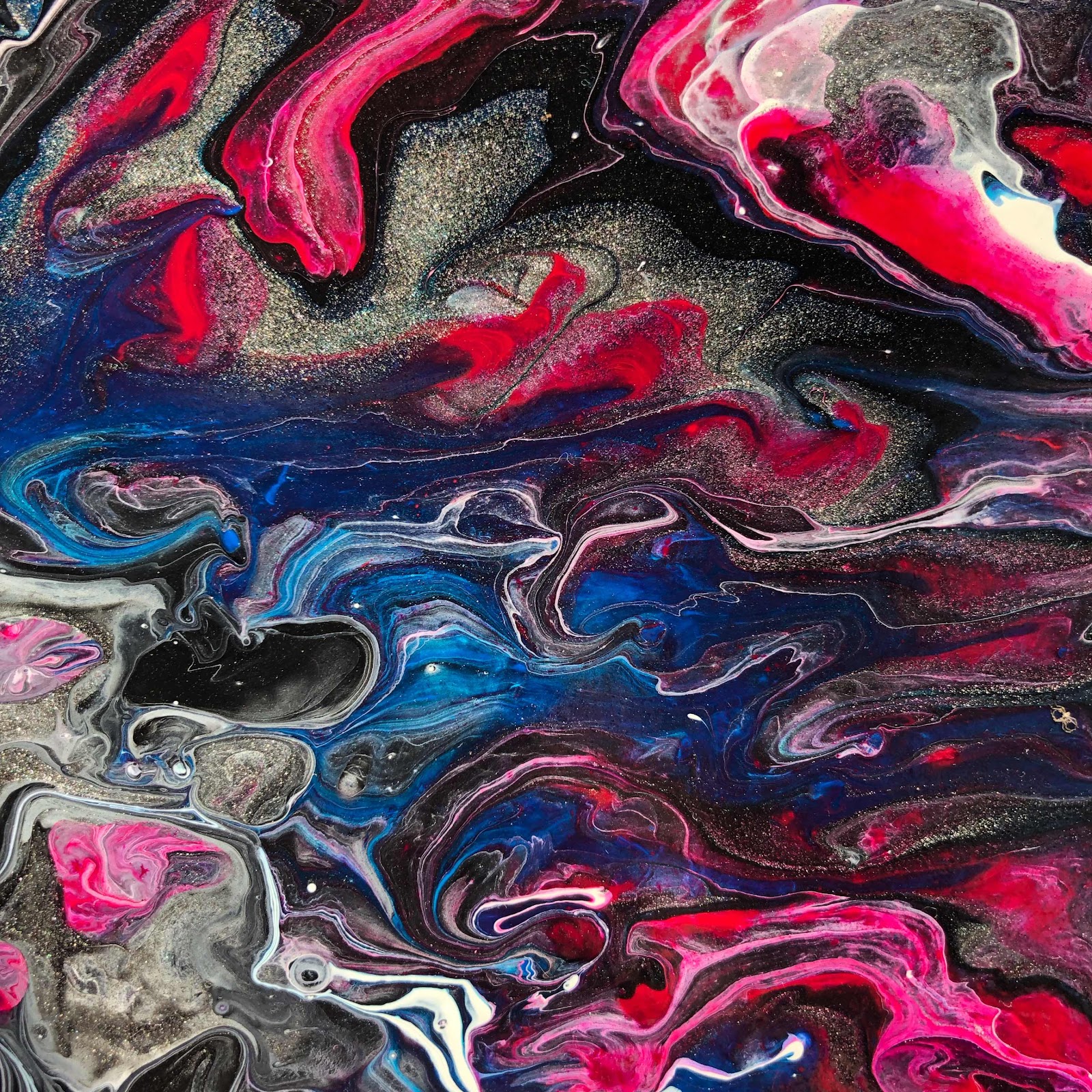
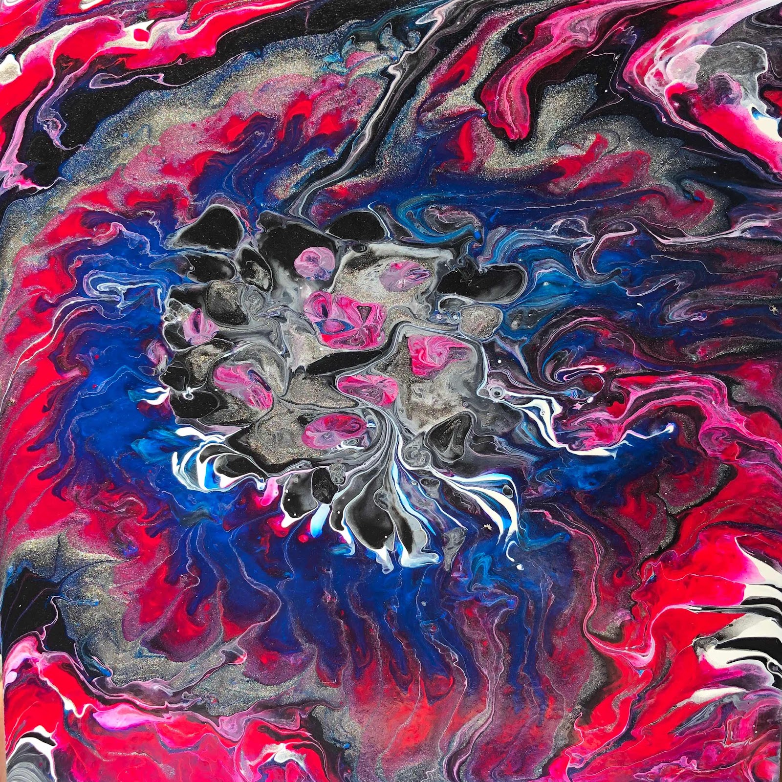
This is my painting ‘Dragons Among Us.’  I’ve got three dragons hidden within the depths of space... can you find them?  I just posted it on my site, www.colorcatstudios101.etsy.com for a mere $90.00.  Christmas is coming, people.  Once this is gone, it’s gone.  These paint pours are what I’d call controlled chaos - I can control them to an extent, but they also have a mind of their own and that’s what makes them so special.  Let’s take a look at this one:  Here’s the entire painting.

It’s 10”x10” on a deep gallery-wrapped canvas.  Some closer detail:

Here it is with my Yeti for size comparison:

Oh my goodness, the colors are just glorious!  The sides are really cool, too.  When you do paint pours, you have to use twice as much paint as would ever remain on the canvas.  It simply has to pour over the edges in order for you to get the movement you desire.  I leave the paint on the edges because it makes the entire piece, front and sides, look like art!  LOVE, LOVE, LOVE THIS!!!


Friday, August 23, 2019

Newest Painting, ‘Festival’

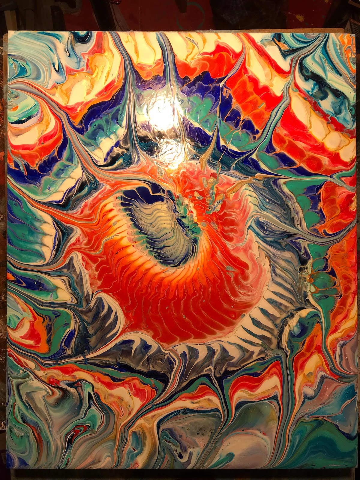
I decided to give you a little tour around my latest painting.  This one is a 16x20 paint pour.  I wanted to incorporate whole bunches of cheery, complimentary colors, a lot of gold and some iridescents for a downright, riotous festival.  Hmm... I should name it festival.  Festival it is!  Now, to cure, then I have to varnish and wire it.  Look for wonderful new stuff being added to my website regularly as I get ready for upcoming shows and Christmas giving. Super bad reflections in this first one; it’s mirror-shiny. :)

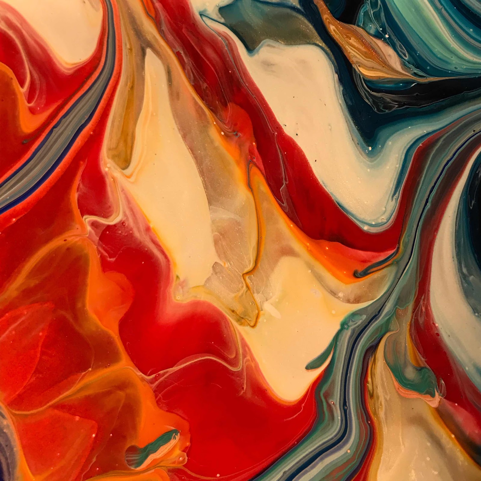
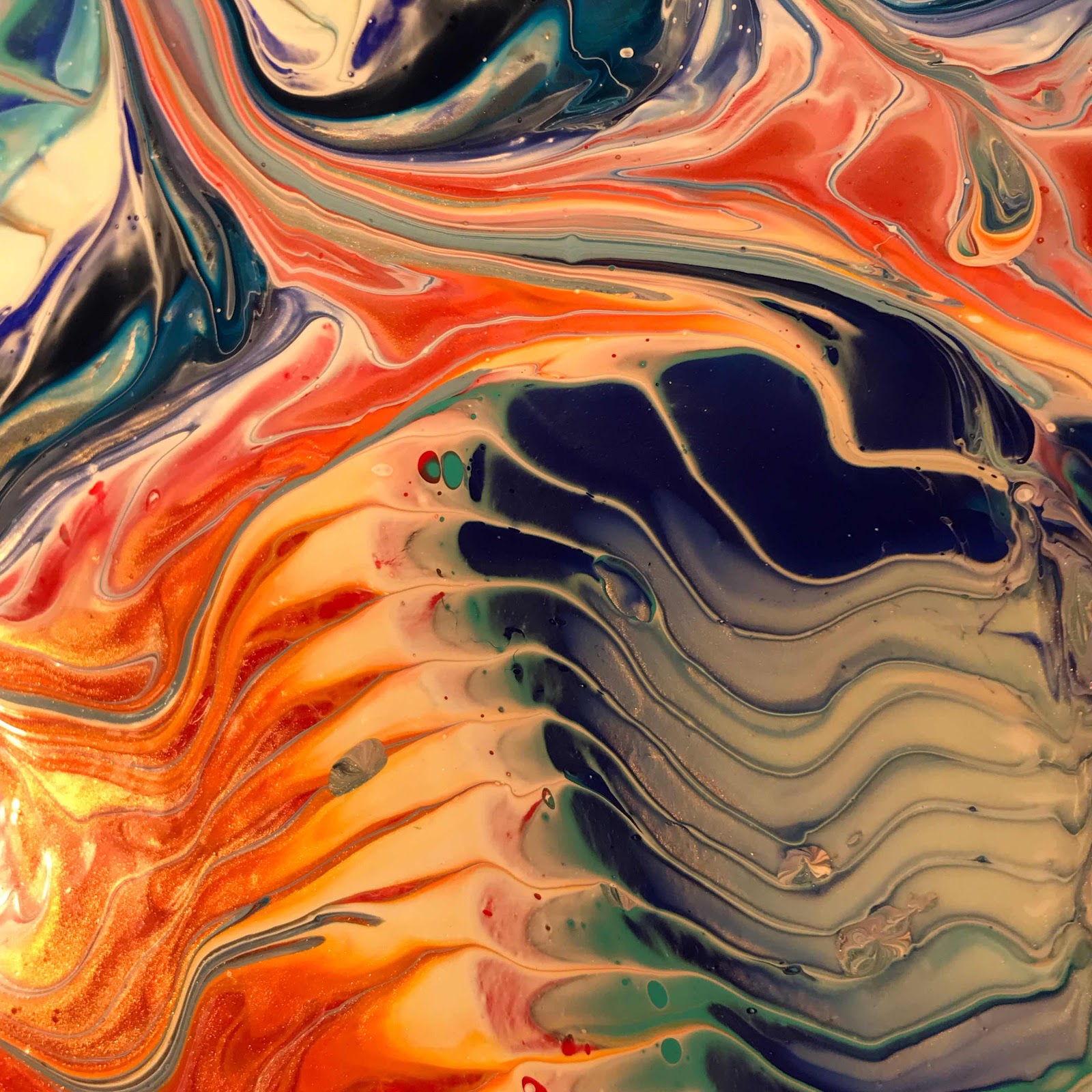
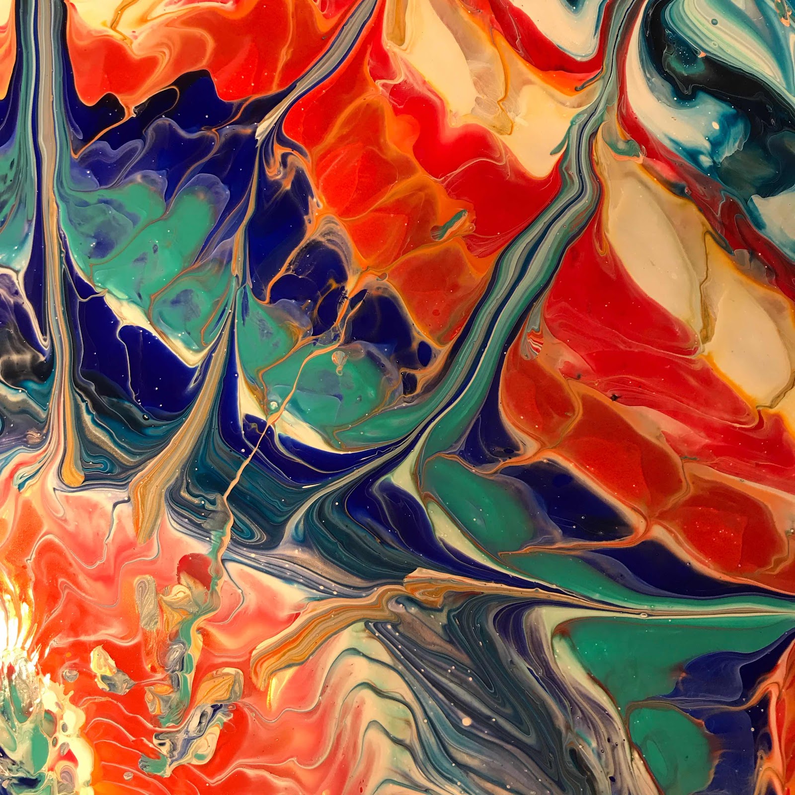
After the entire painting, here are some closeups:

Oh my goodness, I love the way the colors meld and how you can see through the layers.

The above one, where it looks kind of grey, it’s really blues, whites and the iridescents that make it look that way from this angle.

I’ll be putting it up as soon as I get it wired.  If you’re interested, let me know right away as I’m sure this one’s going to go fast!  


SOOOO BEAUTIFUL!


Wednesday, August 21, 2019

Blowtorch Artist Portrait

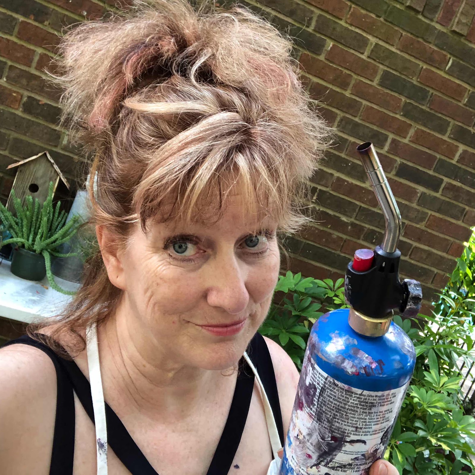
I have a blowtorch and I know how to use it!  What is it for, you ask?  So glad you asked!  It’s to heat any bubbles that form in paint pours so they expand and pop.  Nobody wants unsightly bubbles! The difficulty comes in not scorching or affecting the paint in any way whilst popping bubbles.  Tread lightly!  I’m working hard preparing for the Market Street Art Show coming in September!


Tuesday, August 20, 2019

Paint Pouring

Honestly, you guys, I think these things are bedazzling.  I’m working hard on Christmas gifts and will be loading them onto my website soon. I am loving this closeup.  


This has been one of the most difficult summers of my life.  After shoulder surgery I really spent it all on physical therapy, shoulder care and trying to sleep.  It’s been far too much for me to do my ‘normal’ painting, but these paint flows have been really therapeutic. Since I’ve pretty much dedicated my life learning to color, all I had to do was learn the rudiments of pouring and I’m pretty happy with the results.  

Oh my goodness, isn’t this gorgeous?  I ADORE the pearlescent paint mixed in!  Sooo cool!


After a dry summer of creating almost nothing it feels really good to be able to turn out something that I think is beautiful.  I hope YOU like them too!  This last one is the entire painting.


Friday, August 16, 2019

Paint Pouring Art

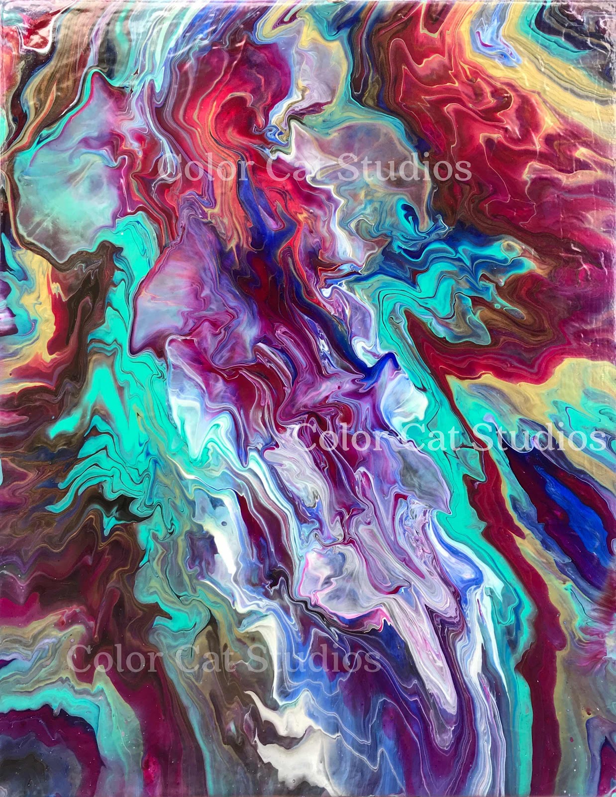
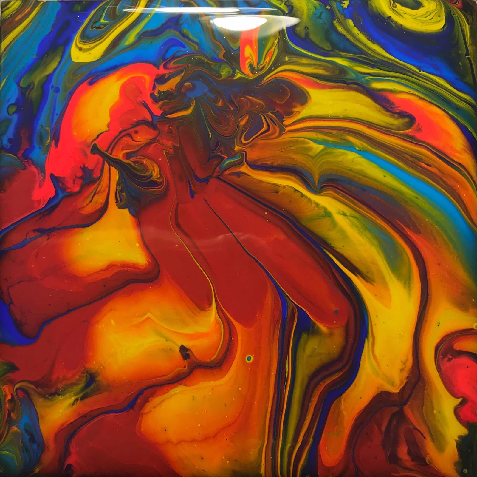
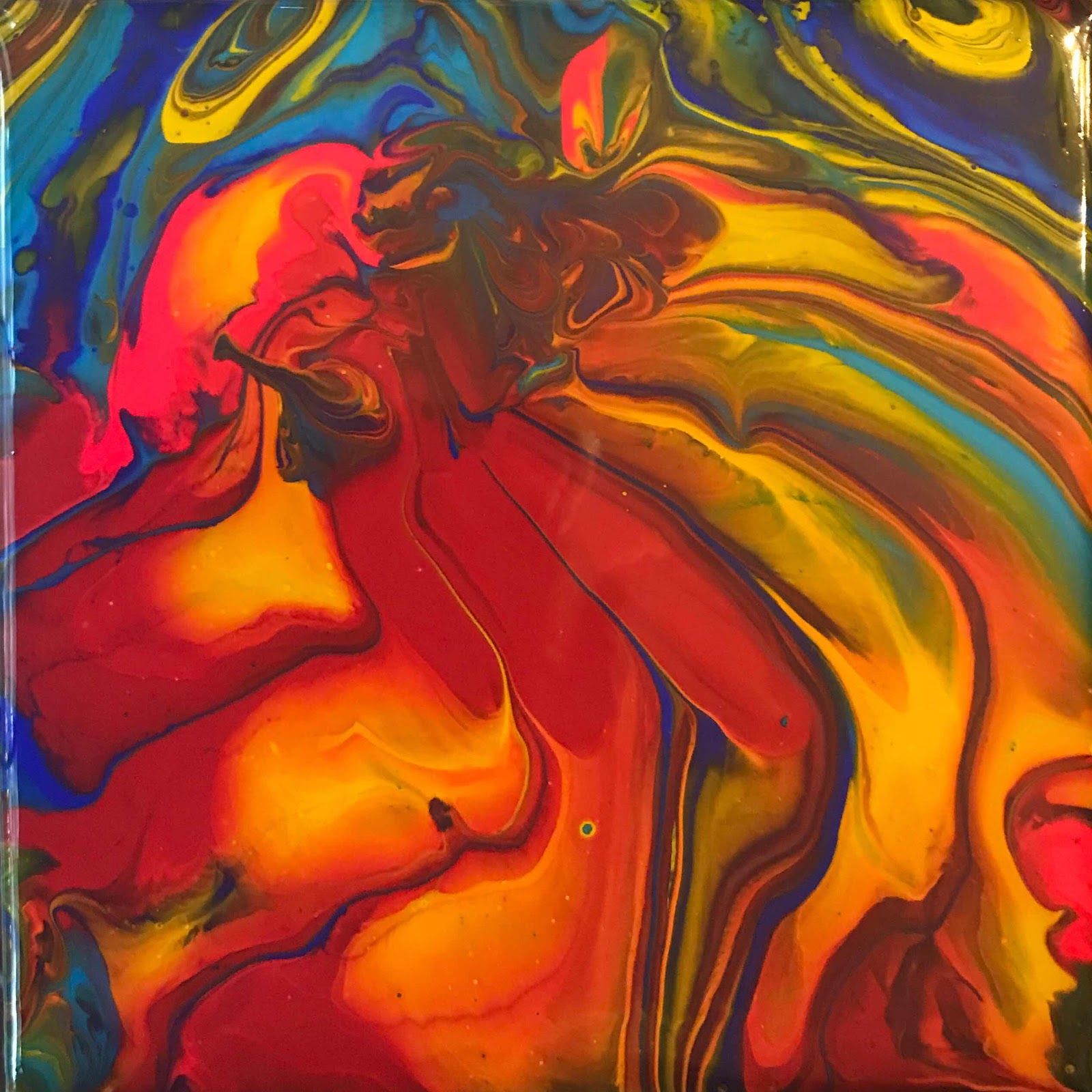
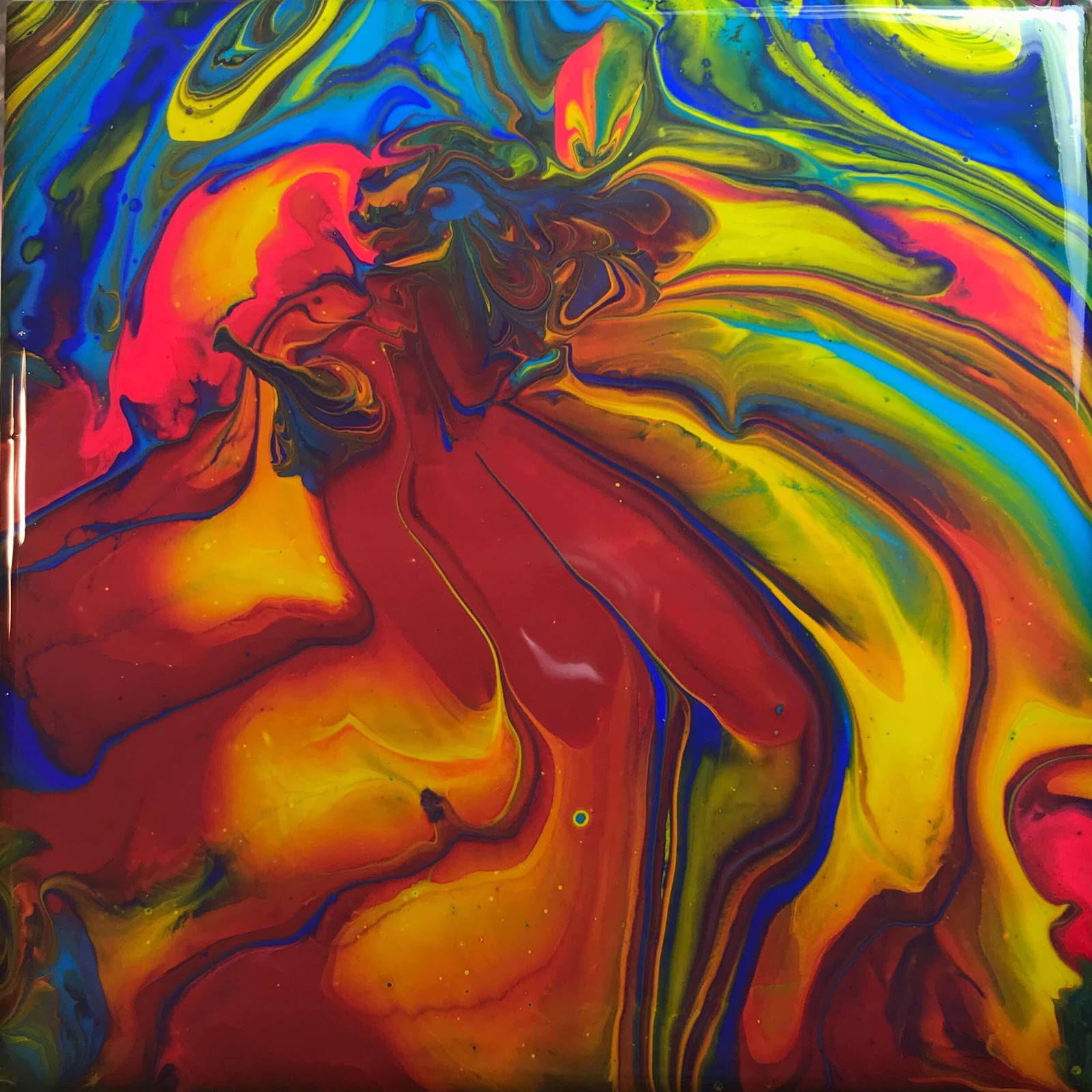
Getting ready for fall shows and Christmas!  These three photos show what different lighting does to a piece of art.  Getting the true colors is always a challenge.  But oh, man, I am loving this one so much no matter how it photographs!


Watch my website, www.colorcatstudios101.etsy.com for all manner of awesome, original gifts; there’s all kinds of wonder there and I will soon be adding every day!

Isn’t this just so cool?  I’m making coasters, of which this is one, 6x6” squares for hanging, 10x10” squares for hanging y mas!


If I had to guess, its true colors lay somewhere between door #1 and door #2.  #3 is leaning a little toward the blue side.


Wednesday, August 14, 2019

Pennants Painting

Pennants for sale!  I thought we needed a little breezy pick-me-up to bring us out of these summer doldrums.  Can’t you just feel the breeze? This painting is for sale on my website and is guaranteed to freshen and fun-up any place you put it.  Because of the warm vs. cool colors it’s extremely hard to photograph.  The photos showing the bright pennants are true to the pennants, but wash out the background.  The ones that make the background glow in turn make the pennants dull.  Just look at them all and believe that the background is bright and interesting and the pennants virtually glow. Here are four different photos; put them all together and they still won’t be as pretty as the original!

The following one isn’t quite this green, but the underlying greens really do glow through the blues.  Also, the flags glow like this and you can see a little texture through them.


The following photo shows better the true colors of the background, but the flags don’t look this dark at all.  You can see here that the background colors really are myriad and can see some of it leaning toward pink.


This last one is truer to the flags, but I’ve also got some of those nasty old reflections in it.  Sigh.


Inspiration?  Well, if I’m driving somewhere and see pennants flapping, I often give in to an irresistible urge, make a u-turn and park under them for a few delightful moments.  Yep.  You should too.  Might just make your day.  Check them out at www.colorcatstudios101.etsy.com.

www.colorcatstudios101.etsy.com

Now, two more:

This first one shows how nice the flag looks, but the background is totally whited out.  This is what I’m talkin’ about!  These flags are gorgeous!


And now this, the flag looks dark and dreary, but the background is more true to color.  I need a personal photographer!  At any rate, this painting glows with color, texture and layers.  It’s just so fascinating to study it will draw you in and you will be LOST WITHIN ITS DEPTHS.